
02.16.10
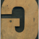
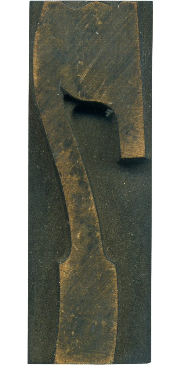
This is the 7 from the French Clarendon set. It’s always seemed a little too condensed for the rest of the typeface to my eyes, but it’s still a lovely and interesting letterform. It’s got the lovely dips in the top, the curve in the slab serif at the bottom, and the beautiful angle where the stem meets the arm and curves out to make the serif. The curve on the serif is particularly fascinating to me, I haven’t seen it on many blocks.
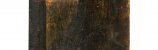
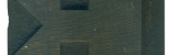
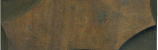
The face of the block is quite streaky, but you can catch glimpses of the wonderful tint of the wood. The streaks are from an incomplete cleaning, Perhaps now that I’ve documented it in this state I will give it a good scrub. The router mark is quite pronounced under the arm.
Style: French Clarendon No. 2
Style first appeared: 1873
Size: 12 line
Manufacturer: Hamilton
Manufacturing Method: Pantograph
Is it part of a complete set? Yes
Leave a Comment
Related Posts