
02.18.10
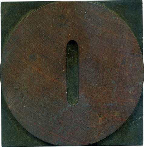
Mmm, a big meaty circle. The difference in this typeface between the Zero and the O is the size of the counter (you can see the whole alphabet on the always valuable Rob Roy Kelly collection website. The narrower counter makes the zero all that more beefy, and the straight sides on the counter make it seem more mechanical, which is fitting for a numeral. It fits very well with ...
Read More →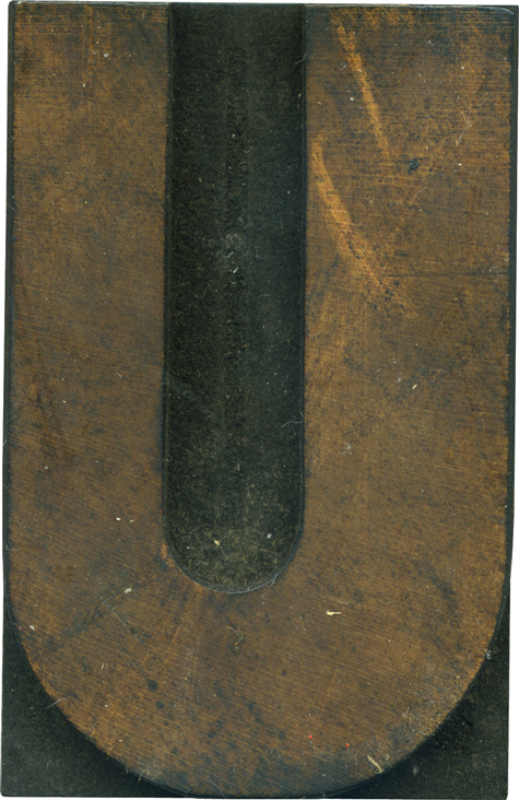
02.17.10
I have a soft spot for U’s with uneven stroke weights, like this one. It lends asymmetry to an otherwise mirrored letterform. I feel like it gives it a weird sense of dimension, like one side it pushing forward. I don’t know which gothic variant this letterform is from, but I’d guess it’s from an early grotesque style with the thick and thin stroke. The face is covered with a film ...
Read More →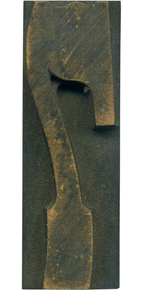
02.16.10
This is the 7 from the French Clarendon set. It’s always seemed a little too condensed for the rest of the typeface to my eyes, but it’s still a lovely and interesting letterform. It’s got the lovely dips in the top, the curve in the slab serif at the bottom, and the beautiful angle where the stem meets the arm and curves out to make the serif. The curve on ...
Read More →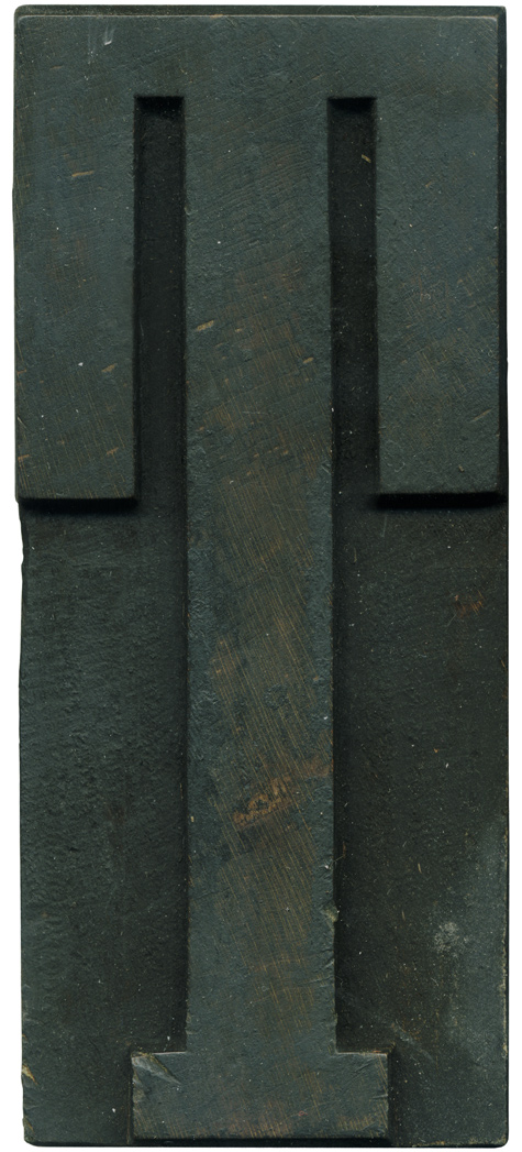
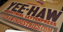
02.15.10
I haven’t had a chance to clean this block yet, so it’s very grungy. I do think it’s important to show the workhorse letters as well, not all blocks are pristine! It’s the sign of a well loved typeface to be covered with ink. I was too excited to hold off posting it because this is one of the letters I was missing from my hand carved Grecian set! The ...
Read More →