
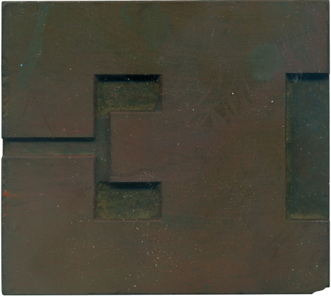
04.14.10
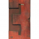
This block is so geometric and graphic, it’s one of my favorite shapes. The negative space is really fascinating. I love how the middle arm of the E is so truncated, how it pushes up against the huge serifs on the top and bottom. It’s like they are blocking it in. I don’t think the block would be nearly as interesting if those serifs weren’t as prominent. There’s a chip ...
Read More →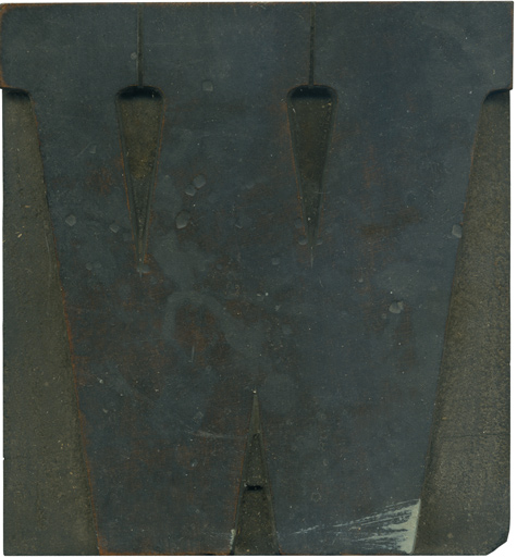
04.13.10
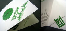
I‘m really becoming fond of this typeface, and I’m itching to print with it! This typeface has a more normally proportioned serif than the French Clarendons, with very rounded brackets. The brackets create a really nice counter shape in between the strokes of the W, it would be fun to use it graphically and play with that negative space. Another filthy block. This one has several pot marks on the face ...
Read More →
04.12.10
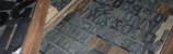
These two guys actually don’t belong together, though they came together in a lot I recently purchased. If you look at the Number 514 specimen page on the Rob Roy Kelly Collection site, you’ll see that the uppercase S should have the same triangular protrusions that the lowercase form does. I think what happened is that the set I bought is actually two similar typefaces mixed together (the other F ...
Read More →
04.09.10
I realized that I haven’t posted anything from the modern poster lot in awhile, so here’s a wonderful O (or zero, it’s hard to tell). This fits into the mold of most of these blocks with an elongated shape, squared off counters and evenly rounded corners. It’s very industrial and serious, you get the feeling this block doesn’t have much of a sense of humor. I love the traces of blue ...
Read More →