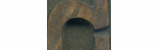

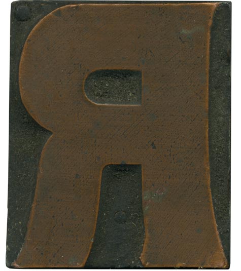
04.26.10
Obviously, this block has a copper face, not wood. It belong to the strange triangular serifed face I bought last month (the Rob Roy Kelly website has a specimen of it). The proportions of this block seem a little off to me. The legs seem a little too tall, and the bowl a little too squished. I love how the right vertical stroke has a curve along the outside. The ...
Read More →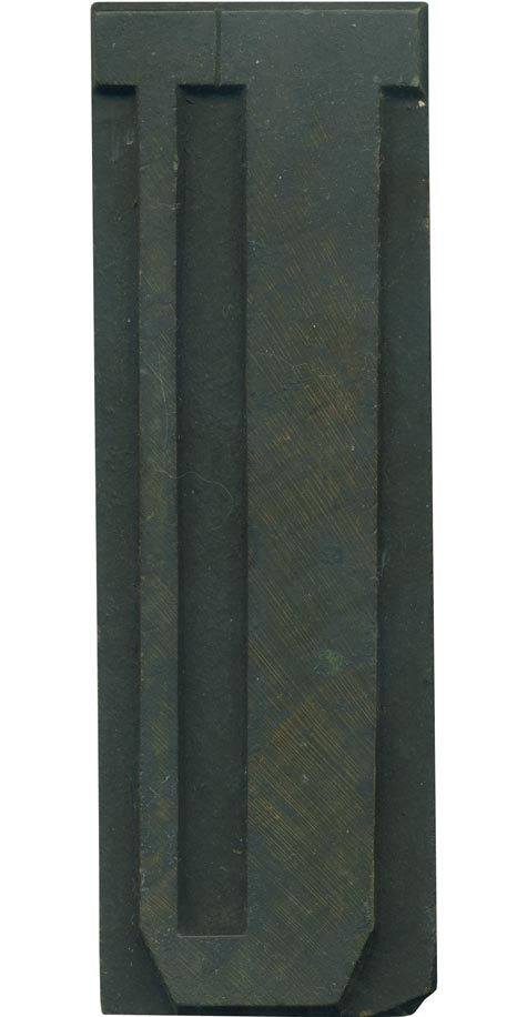
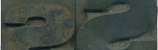
04.23.10
It’s neat to have such a simple, vertically oriented letterform in an extremely condensed typeface like this. The geometric corners only add to the weird, disorienting effect. Your eye almost has to travel down one side and up the other to recognize the letter. The counter space in the middle cuts dangerously low to the bottom stroke, almost cutting the character in half. The difference in stroke width on the ...
Read More →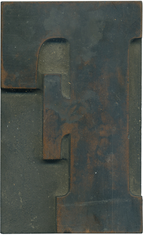
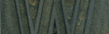
04.22.10
Oh my, this is a nice one. This is one of those letterform/typeface combinations that just belongs as wood type. It’s compacted and a little awkward, the arm of the F has a massive serif that juts up and nearly touches the serif on the top stroke. That top serif is absolutely huge, by the way. It’s the same height as the serif on the cross arm. The brackets on ...
Read More →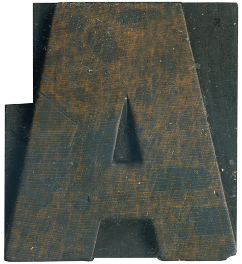
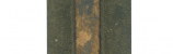
04.21.10
The letter A is one of my favorite, especially when it’s huge and bulbous like this. This is an orphaned block that’s stamp shows it is Hamilton produced. There is a nice shift in weight from left to right, and the crossbar is just thick enough to hold its own with the rest of the face, while still leaving ample counter space. I love the textures that the stain spots have ...
Read More →