02.12.10
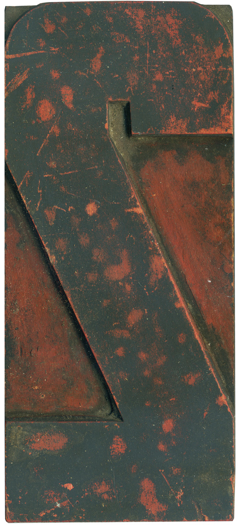
The number 2 seems to be the most frequent figure I post for End Grain. This particular 2 came from the modern poster lot, though it’s smaller than the majority and only has one or two matching figures that go along with it. It’s a variant on the really bulky industrial style 2 that I posted way back at the end of December. The outer corners are rounded while ...
4 Comments » Read More →02.11.10
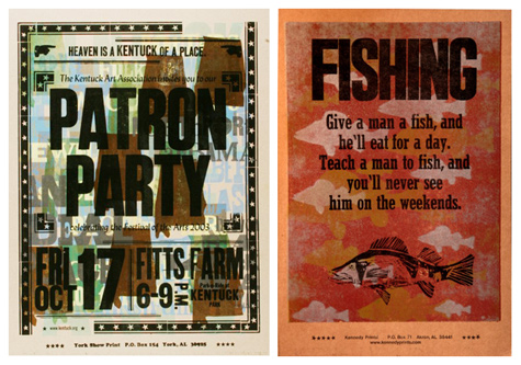
It’s impossible to talk about letterpress in Alabama without mentioning Mr. Amos Kennedy of Gordo, Alabama. I had the pleasure of meeting Mr. Kennedy at a demonstration he did at Auburn while his work was featured in the June Collins Smith museum. He brought one of his Vandercook Sp-15’s, and showed the students how type should be locked up, how the inking process works and let everyone run a print ...
No Comments » Read More →02.11.10
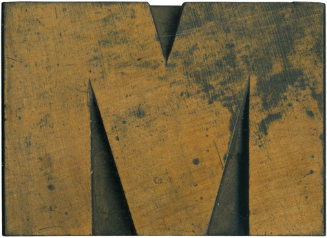
Is there anything better than a nice meaty wood type block? Of course not! This block is from a very early sans serif typeface which I adore, but have been unable to obtain a complete set of. The Rob Roy Kelly Collection has a very similar face. The letterforms are all quite mismatched and awkward and for whatever reason I love it. This M is quite extended, which doesn’t seem ...
No Comments » Read More →02.10.10
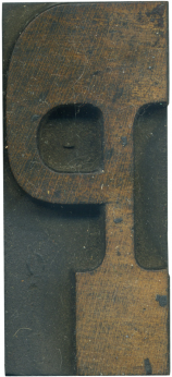
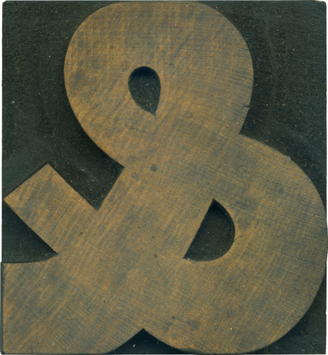
This ampersand is from the gothic set I have. Characteristic of the typeface, it has some variation in the stroke weight, though it’s not nearly as awkward as some of the very early sans serifs. I really love how the stroke widens at the bottom loop of the ampersand. It looks like a living creature coiled up upon itself. The thicker weight also lend it a stability and firmness some ...
1 Comment » Read More →


