04.11.10
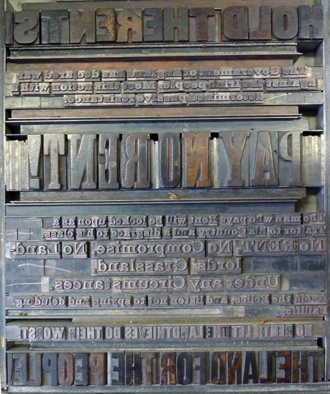
One of the many highlights of my trip to Dublin was a visit to the National College of Art and Design. They have a wonderful letterpress shop that is still put to good use, with several presses and a massive collection of wood type. The shop is run by Professor Sean Sills, and he let us pull prints and explore to our heart’s content. He had incredible portfolios of many ...
No Comments » Read More →04.09.10
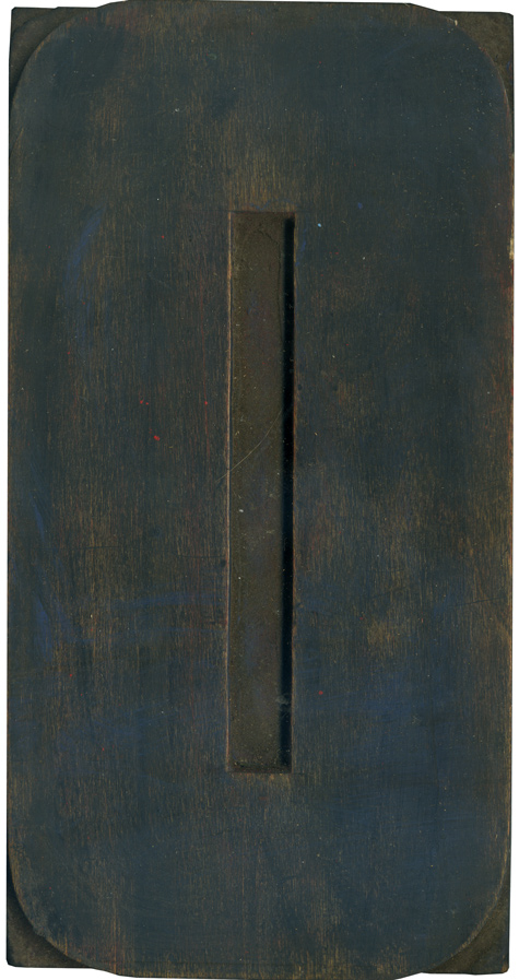
I realized that I haven’t posted anything from the modern poster lot in awhile, so here’s a wonderful O (or zero, it’s hard to tell). This fits into the mold of most of these blocks with an elongated shape, squared off counters and evenly rounded corners. It’s very industrial and serious, you get the feeling this block doesn’t have much of a sense of humor. I love the traces of blue ...
No Comments » Read More →04.08.10
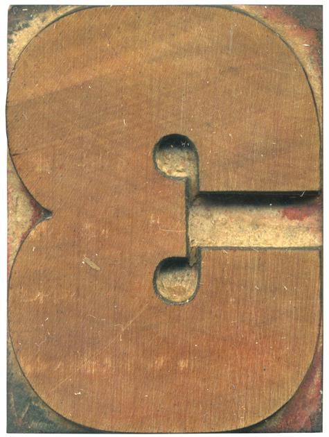
Here is another beautiful beefy figure from the new gothic alphabet I bought. There is less stroke variation on this form; it’s all meaty, all the time. Perhaps that’s why the truncated arm in the middle looks so sad. This issue of real estate on the block was also seen on the number 5 from this set. I love how perfectly round the counter spaces are in the center, and ...
No Comments » Read More →04.07.10
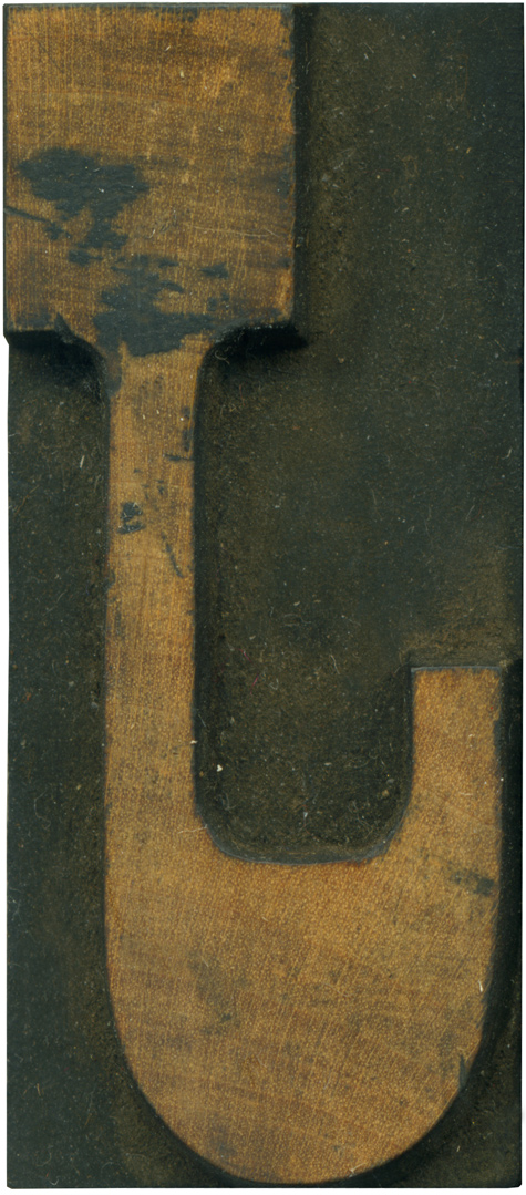
Apologies for not posting a block yesterday, I have been feeling under the weather. Looking at J’s backwards always seems particularly discombobulating. The thickening of the stroke at the bottom is so extreme it dwarfs the serif at the top. I love the sort of squared off counter area above the “hook” of the J. The end of the stroke looks kind of unfinished being lopped off like it is. I ...
No Comments » Read More →


