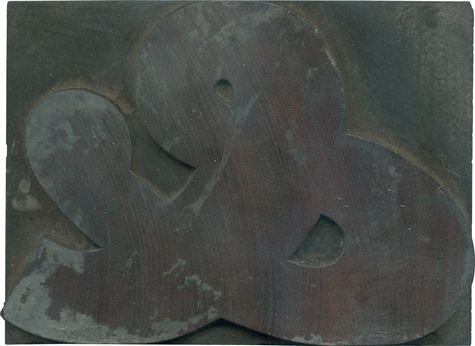
03.12.10
Have you ever seen anything more glorious than this block? Of course not! It’s a gloriously meaty, delightfully curvalicious ampersand with beautiful color shifts in the wood, peeking out from the caked on gunk it acquired from everyday use. It is, like my favorite wood type letterforms just a little awkward yet impossible to ignore. This comes from the Antique set, the major identifier being the ball terminal on one ...
Read More →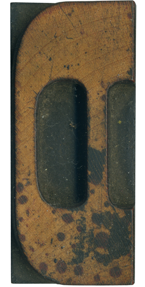
03.11.10
I love this spotted D. It’s from the French Clarendon set, so it has brackets and large slab serifs. I love how the brackets on the right side of the vertical stroke mirror the angle in the counter. This block is very clean outside of the beautiful spots of ink that have stained it. There’s some red along with the black, it’s a really cool effect. The grain has some ...
Read More →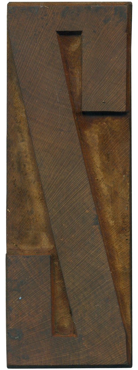
03.10.10
Yay, a Grecian block that isn’t caked with ink! This letterform doesn’t have as many obvious instances of the thick and thin contrast that is a trademark of this particular cut of the Grecian style, but you can see it at the top and bottom. The heaviness of the vertical ends of the stroke are another sign. Often less used letterforms like Zs and Qs are cleaner than the other ...
Read More →
03.09.10
Besides being a very nice condensed sans serif letterform, this block’s defining characteristic is the painful looking wound on the lower end. It hurts me just looking at it. It might have come from a pair of pliers, perhaps whoever tried to rescue it from a life as a wall hanging got a little overzealous in trying to pull it off of whatever it was glued to. I love the ...
Read More →