


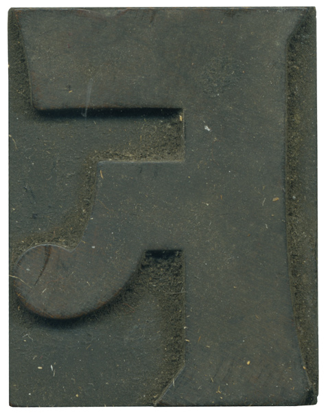
04.01.10
What a great introduction to this bizarre little typeface! The set I have is a little mismatched, but most of the blocks seem to come from this Number 514 typeface, first seen by Page and Setchell in 1887 (many thanks to the Rob Roy Kelly Collection site, as always!). The font in the RRK collection is die stamped, and this set might be as well, I haven’t seen evidence of ...
Read More →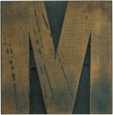
03.31.10
I just realized that I post a lot of Ms for the Daily Blocks. This one is from my first Grotesque set, and as such is a little off kilter, with contrast in the stroke weights. I’ve always been fascinated in the differing angles in uppercase Ms, and how the weight shifts from side to side. The stain splatters are the most defining features of this block. These aren’t just sitting ...
Read More →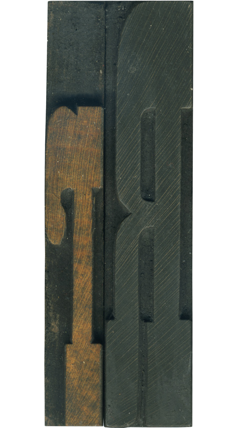
03.30.10
I love these upper and lowercase pairs! These are from my French Antique set, so they feature exaggerated slab serifs. I love the slope on the bottom right side of the leg on the uppercase block. It gives it that little touch of personality. The lowercase R is very playful with its curves and short stature. If you look very closely at the lower serifs you can see the height ...
Read More →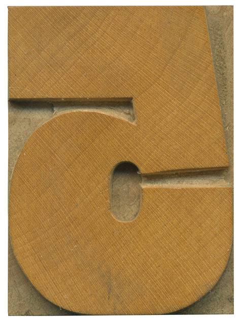
03.29.10
This block marks the return of Daily Blocks and a brand new set of type to analyze, and it also celebrates the release of the Eames typeface by House Industries, which features a lovely set of wood type inspired numerals, and the 5 in particular reflects this typeface (Nick Sherman showed me David Berlow’s Rhode typeface, which is also inspired by grotesque wood typefaces). This gothic face is a grotesque ...
Read More →