05.06.10
I‘m not sure if this is a zero or an O, or if there is much of a difference. I can’t seem to spot on in the Rob Roy Kelly Collection’s specimen page. Regardless, it’s a great letterform. I love just how squared off the corners are, because you expect much more warmth and roundness from an O. The thin stroke weight seems to make it even more alien. This is ...
Read More →
05.05.10
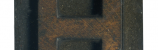
I really can’t appreciate the letter H unless it is in monumetal form like this.Huge strokes, massive serifs, incredible. This block demands respect! Because the serifs on the top and bottom nearly touch in the middle, separated by only a hairline, the letterform is almost abstracted. I love the proportions from the heavy main strokes to the thinner but still substantial crossbar and serifs. These blocks have a lot of hard ...
Read More →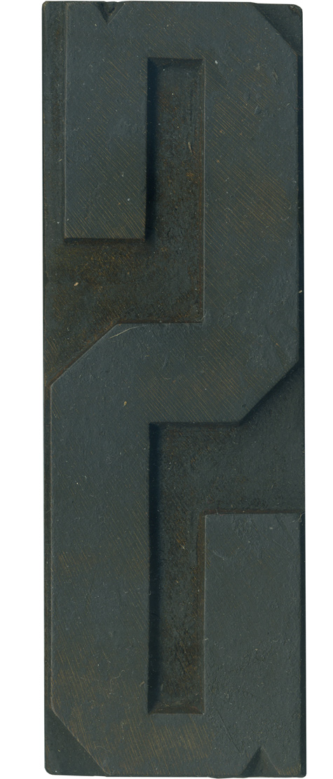
05.04.10
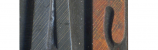
This is a lovely curve-centric letterform in a typeface that has no curves! The top serif is thinner than the massive one at the bottom. This letter has those great notches on the top and bottom that many of the curvilinear letterforms have. I really love the lines on this letter! The shoulder corners have rounded over from old age, and the face is covered with old ink. As with ...
Read More →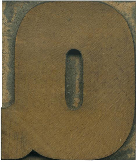
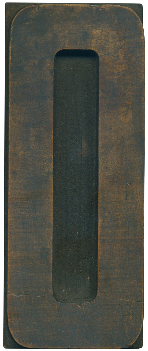
05.03.10
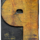
I can’t help but grin at Q’s that are little more than O’s with tails stuck on. Where is the imagination?! There are of course limitations when designing a letterform for a typeface like this. Descenders make type much more difficult to set, and this face is so heavy that if the tail cut through to the counter, there wouldn’t be much negative space left! This is a great straight ...
Read More →