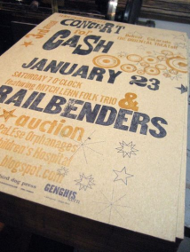
10.13.10
It’s always a joy to see a 1 that’s got a bit of a personality. This typeface is just so quirky, it’s definitely one of my favorites. I love the angle, shape and size of the top of the “flag” of the numeral, and how it’s proportions compare to the main vertical stroke. As is common in wood type numerals, the little guy is stained with red ink. Style: Gothic Style first ...
Read More →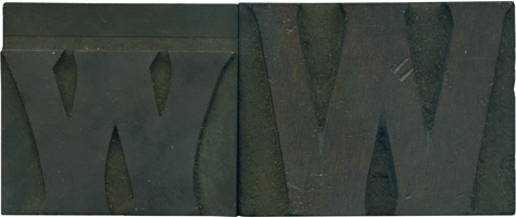
10.11.10
To begin the discussion of these blocks, while I bought these together in one lot, I don’t think these two letterforms are a pair. The lowercase W is obviously a die cut. You can see the horizontal line above the letterform, which is the dead giveaway that a die was stamped onto the wood to make the letterform. But, if you look at the uppercase letter, there seems to be ...
Read More →
10.08.10
We will finish off the week with a very large block from the poster type set. I really love it when normally round letterforms are made more square. This block is especially grimy and dusty. You can see traces of red ink in the counter. Style: Airport Tourist/ Futura Display variant? Style first appeared: 1932 Size: 48 line Manufacturer: Unknown Manufacturing Method: Pantograph Is it part of a complete set? No
Read More →
10.07.10
I think I’ve mentioned before that the uppercase H is a hard letter form for me to love, despite being my last initial. Well, this beauty breaks that trend. It’s formal but friendly with those rounded brackets which make such a neat little circle shape at the top and bottom. The face is a stunning, rich reddish color that’s got blotchy, caked area on it, which just add to its ...
Read More →