01.06.10
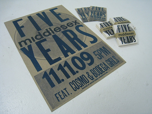
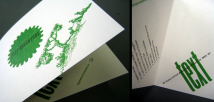
Repeat Press is a letterpress shop in Boston, and owner Mike Dacey has a wonderful portfolio full of wood type and polymer plate work. I especially love the abstract prints he’s done with large poster type. Be sure to watch this very well donevideo of the creation of a wonderful project he did for High Snobiety and Selectism. Be sure to check out his website and view the rest of his ...
No Comments » Read More →01.06.10
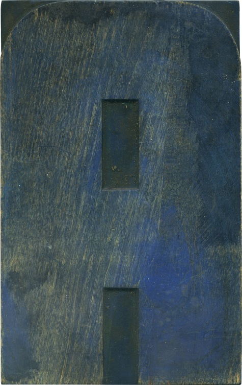
Back in August I bought several lots of poster type, most of which is over 7 inches tall. I was intrigued because many of the letters were in this style, a rounded, modern style sans serif. This A matches up with an E, which is also stained with this lovely blue.
2 Comments » Read More →01.04.10
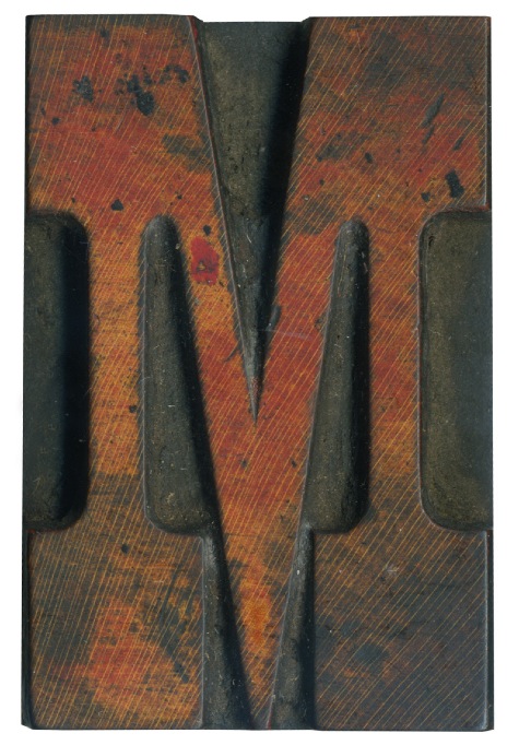
I absolutely adore French Clarendon typefaces. They are one of the first styles I think of when I think of vintage poster type. This letter is from the first complete alphabet I bought, and it’s one of the few from that set that had remnants of a color ink. This face has a a great variety of color and texture. I love the way the black ink has left splotches ...
1 Comment » Read More →12.31.09
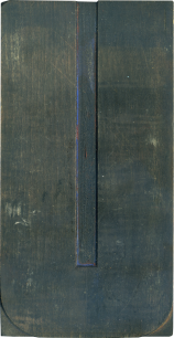
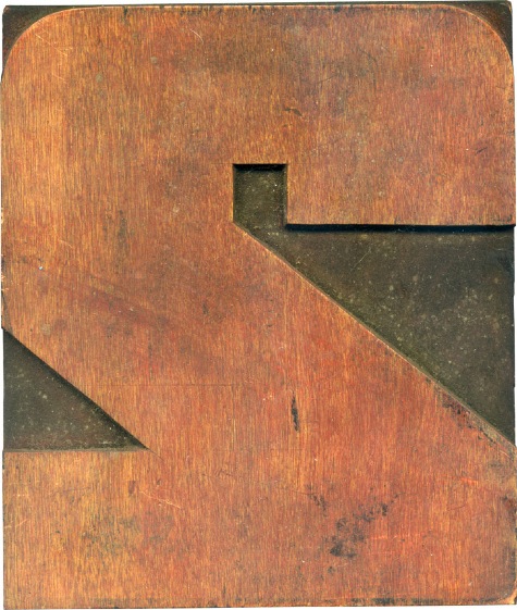
For some reason this seems like a good block to bring in the New Year. This is another large number with the evidence of red ink. Big, beefy, squared off, it’s very nice and no-nonsense.
No Comments » Read More →

