04.21.10
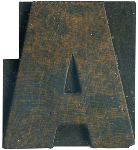
The letter A is one of my favorite, especially when it’s huge and bulbous like this. This is an orphaned block that’s stamp shows it is Hamilton produced. There is a nice shift in weight from left to right, and the crossbar is just thick enough to hold its own with the rest of the face, while still leaving ample counter space. I love the textures that the stain spots have ...
1 Comment » Read More →04.20.10
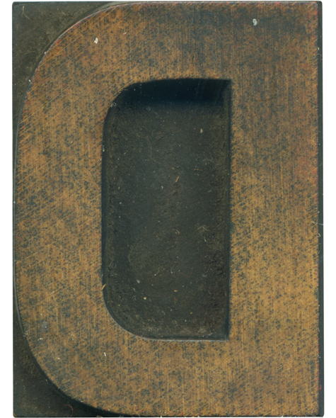
This is a much later typeface than most of the gothics I have been posting (the Rob Roy Kelly Collection website has a font similar to this one). The stroke weight is pretty even, and the lines are very orderly. The counter space is very generous as well. It’s a very open, stoic letterform, and in my opinion, lacking the personality of the earlier grotesque faces. They are useful for ...
No Comments » Read More →04.19.10
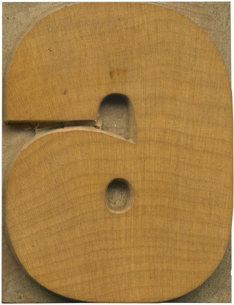
Doesn’t this 6 look like it’s sporting a crazy pompadour? This is another numeral from the new grotesque set, and like the others it is extremely heavy and has a lot of personality with its thick and thins and exaggerated shapes. The looping top stroke almost feels too heavy for the loop at the bottom, the figure almost seems like it could tip over from the weight. The tiny size ...
No Comments » Read More →04.16.10
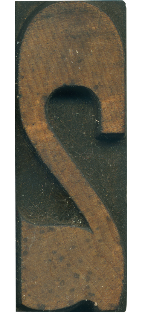
What a glorious little number this guy is! This is from my French Clarendon set, with its extremely thick weight at the top and bottom and thin vertical strokes. The little wave-kick at the bottom is one of my favorite parts of any block. A flat bottom would have sufficed, but the contour really elevates the design and gives it a definite attitude. The top of the leg is contoured ...
1 Comment » Read More →


