06.21.10
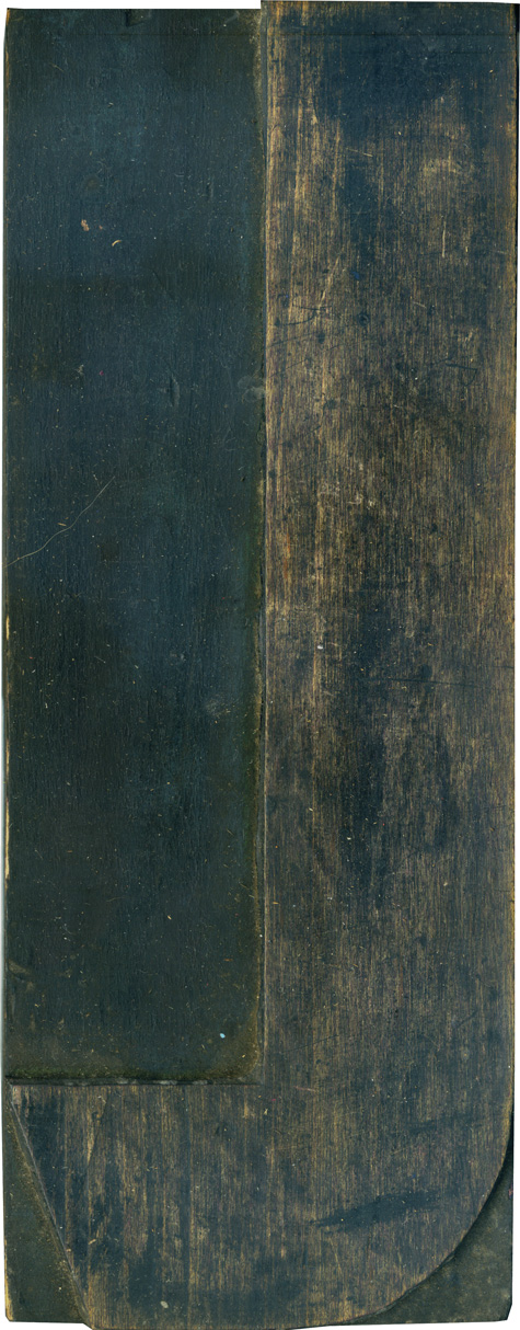
The leg on this L is very short, but when you see it in use it doesn’t look all that out of place. I love that the end of the stroke has that angle, it gives a simple letterform a lot of extra flair, and keeps it from looking too bulky, even with the extremely thick stroke weight. Style: Airport Tourist/ Futura Display variant? Style first appeared: 1932 Size: 48 line Manufacturer: Unknown Manufacturing Method: ...
No Comments » Read More →06.18.10
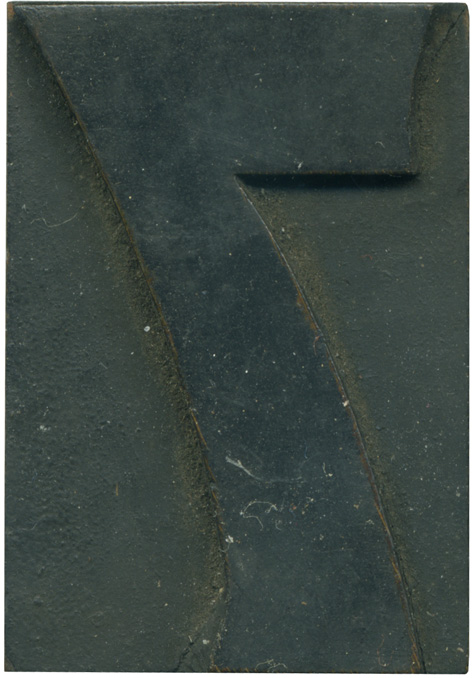
Another lovely numeral from the 514 set to close out the week. It’s such a varied typeface, with straight lines, curves, indented stroke ends and those cute little triangular serifs. You can just barely see the wood grain along the edges of the face. I hope to have some exciting news regarding a collaborative project next week, everyone cross your fingers! Style: Number 514 Style first appeared: 1887 Size: 8 line Manufacturer: Hamilton? Manufacturing Method: Die ...
No Comments » Read More →06.17.10
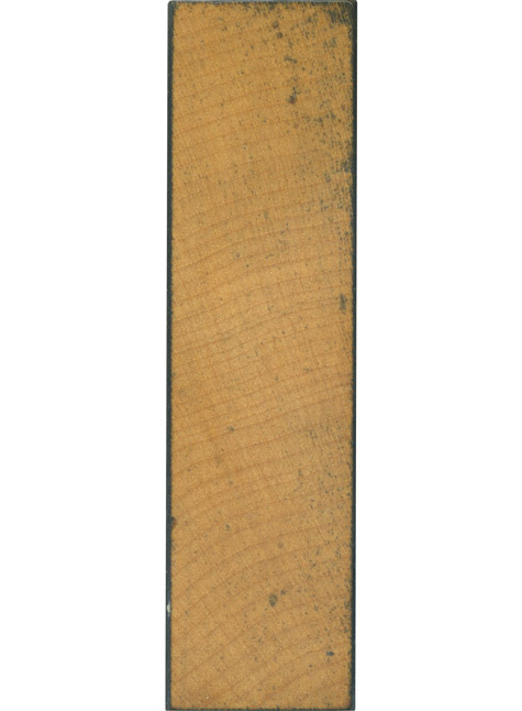
I don’t post many I’s on End Grain because, well, they tend to look like this. Not that that doesn’t have its merits, of course. This is a lovely, simple block with a fantastic grain. I love how the stains creep in from the upper left, but leave most of the face unobstructed. Style: Gothic Style first appeared: Unknown Size: 15 line Manufacturer: Hamilton Manufacturing Method: Pantograph Is it part of a complete set? Yes
No Comments » Read More →06.16.10
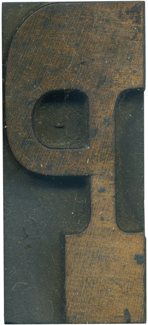
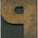
This letterform seems very unbalanced to my eyes. The bowl coming out of the thick serif at the top makes it so top heavy, and it seems like it could top over to the left at the slightest provocation. I love the color of the wood, and how the top of the letter is more stained than the bottom. Style: French Clarendon No. 2 Style first appeared: 1873 Size: 12 line Manufacturer: Hamilton Manufacturing Method: ...
No Comments » Read More →




![PROFESSOR TOBIN […] SPIRITUALISM’S HUMBUGS / SPIRITUALISTIC JUGGLERY / EXPOSED 💀](https://live.staticflickr.com/65535/54098372074_20bc775da2_s.jpg)
![HERR DOBLER […] ✠ DARK SEANCE ✠](https://live.staticflickr.com/65535/54097172372_f3d1807bd4_s.jpg)
![HERR DOBLER […] DARK SEANCE 👻](https://live.staticflickr.com/65535/54098371949_d42db78b79_s.jpg)


![Red Roses Press [Wood Type]](https://live.staticflickr.com/65535/53488240739_825eec6c1e_s.jpg)


