09.17.10
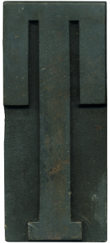
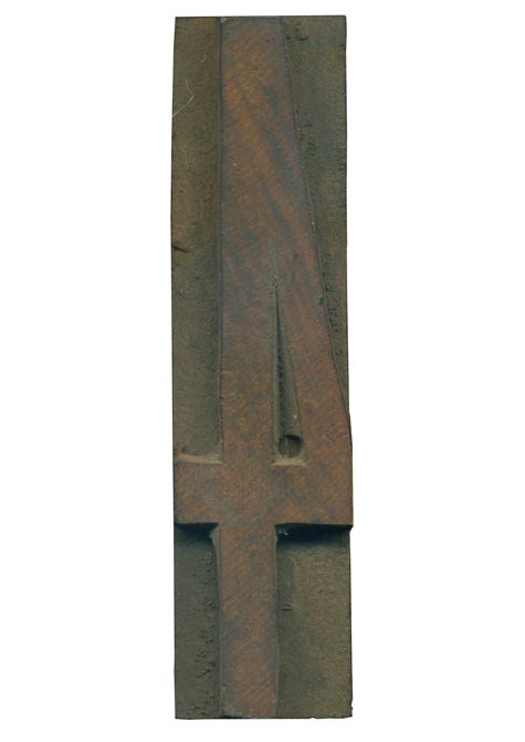
I am on a serious sans serif kick lately, so when I got the chance to get a super condensed set of wood type, I jumped at the chance. This 4 is a lovely little specimen. The letterform itself is very no-nonsense and has a great presence despite being so tall and lean. The work of hand finishing and pantograph carving is very clear on this block. My favorite part is ...
No Comments » Read More →09.16.10
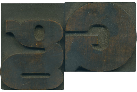
Is there a stranger creature in the wood type world than a lowercase G? They are often squished, disproportionate and deformed, but are almost universally charming. This little guy has a vertically oriented counter, but the bowl at the bottom is little more than a rounded horizontal slit. The connecting stroke in the center is basically the same massive width as the stroke on the uppercase letterform. It is fascinating ...
1 Comment » Read More →Ok, so I am a terrible blogger and I am deeply sorry to the readers of the site for disappearing. I have senior project going on in my final semester of school and the server had a malware attack that slowed things down. But I am back! And I have new type!!! And I got to meet some great printers in a trip up the east coast! I have lots ...
1 Comment » Read More →07.21.10
You don’t really know a piece of type until you print it, so when the school got the SP-15, I set out to reintroduce myself to some of my newer fonts. I actually don’t have a lot of experience printing on a press, which is evident in the fact that I had trouble getting even ink coverage on some of the fonts. The 514 set proved the most difficult. The ...
1 Comment » Read More →





![PROFESSOR TOBIN […] SPIRITUALISM’S HUMBUGS / SPIRITUALISTIC JUGGLERY / EXPOSED 💀](https://live.staticflickr.com/65535/54098372074_20bc775da2_s.jpg)
![HERR DOBLER […] ✠ DARK SEANCE ✠](https://live.staticflickr.com/65535/54097172372_f3d1807bd4_s.jpg)
![HERR DOBLER […] DARK SEANCE 👻](https://live.staticflickr.com/65535/54098371949_d42db78b79_s.jpg)


![Red Roses Press [Wood Type]](https://live.staticflickr.com/65535/53488240739_825eec6c1e_s.jpg)


