09.24.10
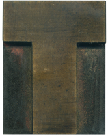
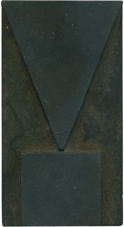
Can you get more geometric and forceful than this guy? When you stick this guy at the end of a sentence, you have to mean it. I was printing yesterday and saw a poster I had pulled with this block on it and I had to laugh at how bold it is. I like how the end of the top portion of the block doesn’t come to a point at ...
No Comments » Read More →09.23.10
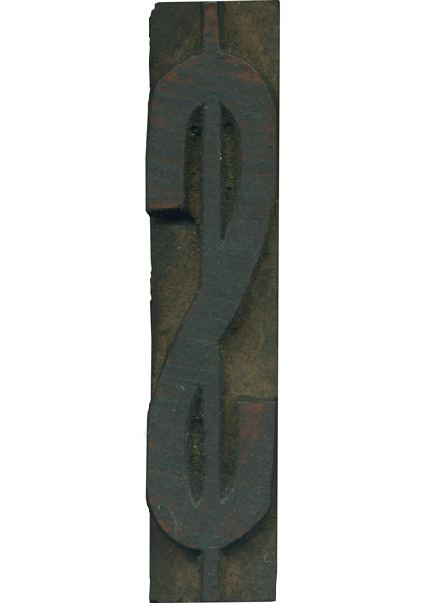
A dollar sign that looks like it’s been squeezed for every last drop. This block is interesting fr how many imperfections there are in the shaping of the face. A lot of the curves are uneven, probably due to a lof of fine hand finishing required on such a narrow block. The block is a bit grimy, but you can see the reddish face peeking out in a few spots. Style: ...
No Comments » Read More →09.21.10
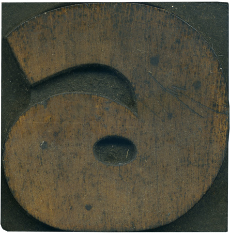
Who doesn’t love a big, juicy numeral? This little guy definitely has an attitude. The stroke contrast is really heavy in this block, from the thinning of the line above the counter to the extremely thick portion on the right side. There are some scratches on the right side of the face, not sure if they show up in print yet. The wood has a yellowish tone and you can ...
1 Comment » Read More →09.20.10
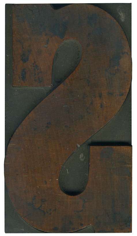
This is a big, beautiful, curvy S. I love how the stroke is narrower at the top of the letterform to clarify which is the top and which is the bottom (I need all the help I can get when I’m setting type). Despite the heavy slab serifs, the block avoids looking clunky, and still has some great lines. The wood grain is fantastic; a wonderful, dark color. There is ...
No Comments » Read More →





![PROFESSOR TOBIN […] SPIRITUALISM’S HUMBUGS / SPIRITUALISTIC JUGGLERY / EXPOSED 💀](https://live.staticflickr.com/65535/54098372074_20bc775da2_s.jpg)
![HERR DOBLER […] ✠ DARK SEANCE ✠](https://live.staticflickr.com/65535/54097172372_f3d1807bd4_s.jpg)
![HERR DOBLER […] DARK SEANCE 👻](https://live.staticflickr.com/65535/54098371949_d42db78b79_s.jpg)


![Red Roses Press [Wood Type]](https://live.staticflickr.com/65535/53488240739_825eec6c1e_s.jpg)


