10.04.10
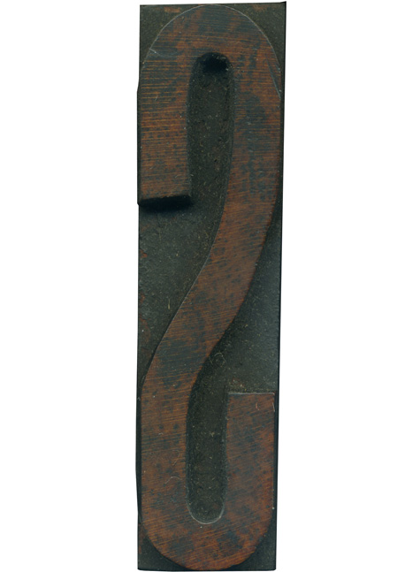
Here is a slender S from the new condensed gothic set. I’m always surprised at the little touches you can see in these hyper condensed letterforms when you blow them up. The stroke thins out just barely at the top and bottom. There are a lot of irregularities in this block,look at the right edge of the center part of the letter and how it bulges and seems to flatten ...
No Comments » Read More →09.29.10
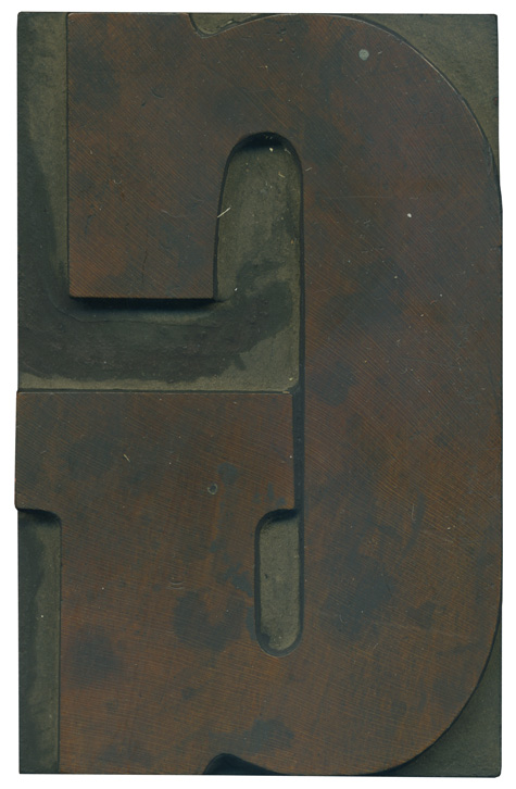
Here is a nice, stately G. I love how the stroke narrows at the top and bottom of the curve, which helps keep the extreme width on the vertical stroke from looking too chunky or clumsy. It makes very good use of the space on the block. The wood grain is splendid, radiating out from the lower right part of the block. Style: Clarendon Condensed Bold Style first appeared: Late 1800’s Size: 24 ...
No Comments » Read More →09.28.10
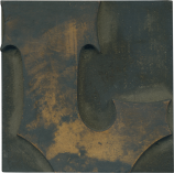
I have had a few questions lately about the process I used a few semesters ago to create new movable type from plywood and plexiglass, so I thought I’d recap that process today and show a test print I made several months ago using both my wood type and the plexi type. I have access to a great laser printer though the industrial design department at Auburn University, and it seemed ...
7 Comments » Read More →09.27.10
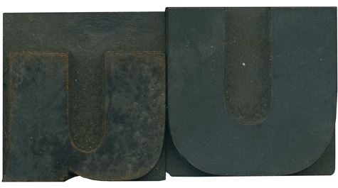
Here is another family pairing form my new gothic set of type. As I’ve mentioned before, I have a soft spot for the letter U, especially when it has an uneven stroke weight. It’s a little more subtle on this one, but it’s thicker on the right side. This is mimicked in the lowercase form, which sharply thins out along the bottom of the stroke. The tail has a outward ...
No Comments » Read More →
