
10.28.10
Love the contrast between the right angles of the uppercase H and the curves in his lowercase partner. I love how the stroke on the lowercase letter starts out so thin and skillfully cascades into a huge, thick stroke on the left side. The lowercase letter has some bad scratches that are probably going to show up in a print. Style: Gothic Extended (still researching) Style first appeared: Unknown Size: 12 line Manufacturer: Unknown Manufacturing ...
Read More →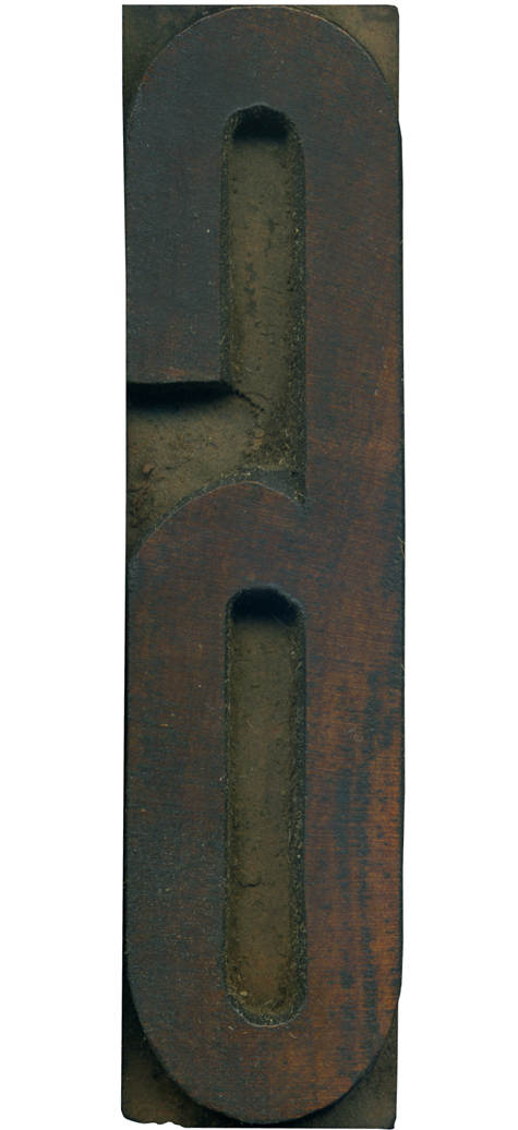
10.26.10
Here is a scrawny little numeral. I think the wood color on this block is just gorgeous, and the curves are perfect. They aren’t quite perfectly geometric, leaving a little room for personality. You can see evidence of hand finishing in some of the irregularities in the counters. Style: Gothic Condensed (still researching) Style first appeared: Unknown Size: 18 line Manufacturer: Unknown Manufacturing Method: Pantograph Is it part of a complete set? Yes
Read More →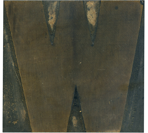
10.21.10
I think this block has a great rhythm in how the stroke weight shifts from right to left. The whole letterform is just barely asymmetrical, which is one of my favorite parts of this typeface. It’s more uniform than many of the old sans serif faces, but it’s not as geometric as the later gothic faces. You can see the rings of the wood radiating out from the top left ...
Read More →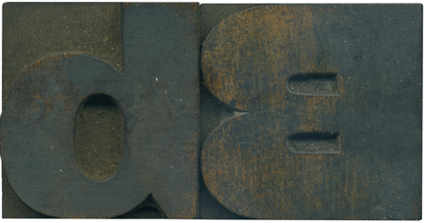
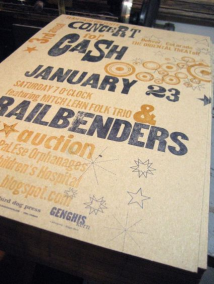
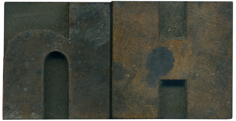
10.18.10
Here is a happy little couple. The uppercase letterform is so thick and boisterous, and the lowercase letter is much more subdued. The counter in the bowl of the lowercase letterform is positively gigantic compared to the squished in counter spaces on the uppercase B. You can see streaks of their yellowish faces from behind the grime. Style: Gothic Extended (still researching) Style first appeared: Unknown Size: 12 line Manufacturer: Unknown Manufacturing Method: Pantograph Is it ...
Read More →