

11.15.10
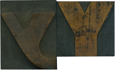
This lowercase Y is just incredible. I love how irregular and playful it is compared to it’s older brother. It’s almost nebulous, like it was formed accidentally. i think with a bit of cleaning the face on the lowercase Y will be the same bright golden tone of the uppercase letter. I love the blotchy stains on the uppercase letterform. Style: Gothic Extended (still researching) Style first appeared: Unknown Size: 12 line Manufacturer: Unknown Manufacturing ...
Read More →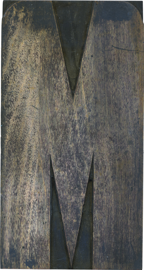
11.10.10
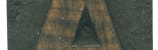
Iposted about this block awhile back, i think but I wanted to revisit it just because it’s so bizarre. When you think of typeface styles that were commonly used in wood type, this probably doesn’t come to mind. This block came in the same lot as the J I posted earlier, and was probably cut by a printer as well. It’s so exaggerated from a vertical standpoint, it’s almost cartoonish. ...
Read More →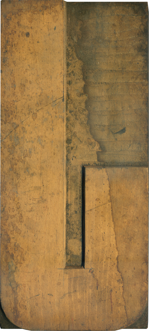
11.09.10
Ah, what a big, wonderful piece of work this is. I would guess this was cut by a printer; you can see the pencil marks along the counter, and the shoulder has been cleared away rather haphazardly. You can see the grooves left by the router winding back and forth on the upper right. I’m hesitant to print with a black as, well, naked as this for fear of staining ...
Read More →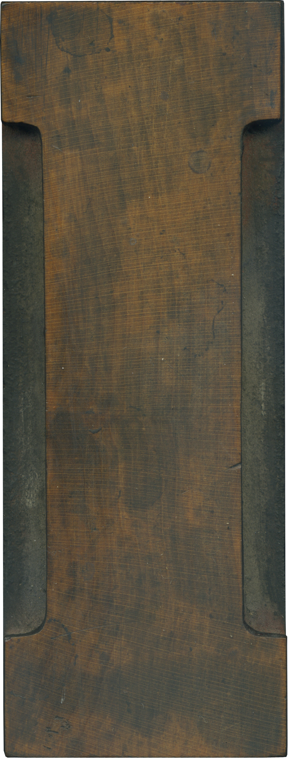
11.05.10
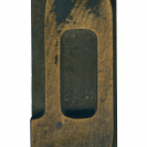
Back to back Clarendon’s to close out the week! The capital I tends to be a rather nondescript letterform, and this is one of the more elaborate ones I have. Like the X I posted earlier this week, this block was cut from a sizable tree, and the face is absolutely gorgeous. There’s one wound on the lower right edge, and though i don’t have my proofs here with me, ...
Read More →