


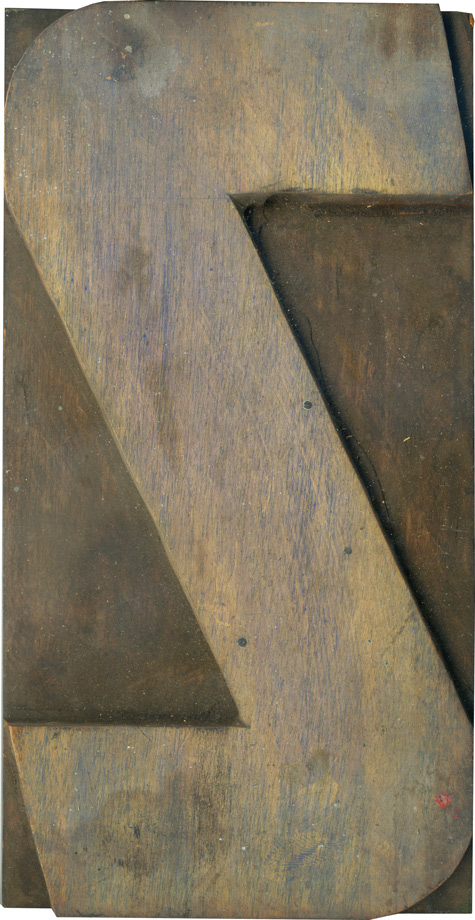
05.12.10
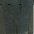
I really love this letterform. While the S’s in this set use right angles. the Z is defined by this great diagonal cutting across. The curves at the corners are very generous as well, so it’s a great juxtaposition of the harsh angels and the rounded edges. I also like how the ends of the stroke are angled. This is a side grain block, with traces of blue ink in the ...
Read More →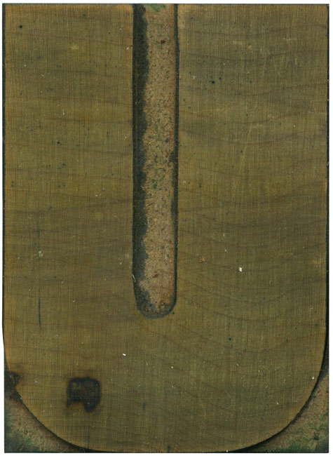
05.11.10
Ah, is there a more glorious creature than the unevenly stroked U? This one is just uneven enough to be obviously intentional. The curves at the base are regimented and even, a trademark of this typeface. I’d love to do a version of this typeface with squared off counters in the interior, it would make the face much more industrial, and it might looking interesting considering the variation in stroke ...
Read More →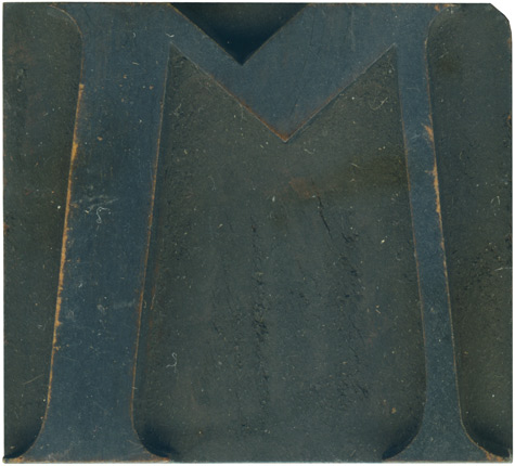
05.10.10
Back in February, Mr. Wolske posted this curious M on his Letterpress Daily blog. According to that post, this is an alternate M (the Rob Roy Kelly site has a different M in their De Vinne showcase). It’s certainly an odd letterform, with its extremely shortened central portion, and it wasn’t until I read Mr. Wolske’s post that I was certain it was an M and not a W. I ...
Read More →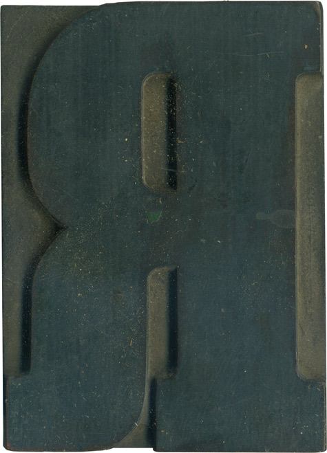
05.07.10
One of my favorite things about these older clarendons is that the top counter on letters like the R is completely rounded off, instead of having a straight edge next to the main vertical stroke. It really looks peculiar, especially in print. One of my favorite things about collecting wood type is seeing typographic details that didn’t carry over to modern day use. This R is incredible solid, the vertical ...
Read More →