


11.24.09
Now, I have to admit, I am partial to big, chunky wood type letterforms. But there is something charming about the more classical serifs in type, especially the numbers.
Read More →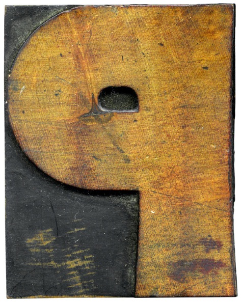
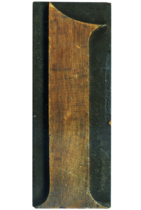
11.23.09
Mmm, what a lovely face on this block. Wonderful texture and coloring.
Read More →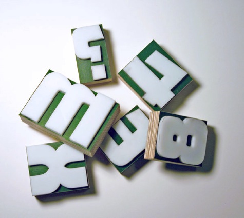
11.23.09
This set is the final we created this semester, and was a direct reproduction of Matinee Gothic, a wonderful typeface designed by Jim Parkinson. I found the typeface when I was trying to find a font with the mysterious M in it, and while this typeface has a much different M, the rest of the letterforms match the one’s from the lot I purchased fairly closely. This is the Mystery font ...
Read More →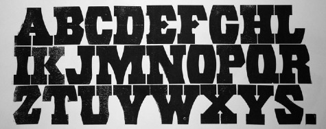
11.19.09
After we had success creating and printing a partial set of movable type to complete the Futura Condensed typeface, we moved on to creating one set derived from a specimen from Rob Roy Kelly’s book, Untitled 504 (Rob Roy Kelly mis-identified this face as Untitled 154 in American Wood Type, many thanks to the invaluable Rob Roy Kelly Collection website). I’ve always wanted a set in this typeface so it ...
Read More →


![PROFESSOR TOBIN […] SPIRITUALISM’S HUMBUGS / SPIRITUALISTIC JUGGLERY / EXPOSED 💀](https://live.staticflickr.com/65535/54098372074_20bc775da2_s.jpg)
![HERR DOBLER […] ✠ DARK SEANCE ✠](https://live.staticflickr.com/65535/54097172372_f3d1807bd4_s.jpg)
![HERR DOBLER […] DARK SEANCE 👻](https://live.staticflickr.com/65535/54098371949_d42db78b79_s.jpg)


![Red Roses Press [Wood Type]](https://live.staticflickr.com/65535/53488240739_825eec6c1e_s.jpg)


