11.22.10
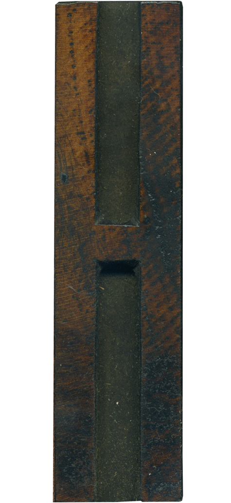
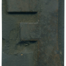
This H has such a lovely face, though there isn’t much of it because this a relatively thin and very condensed letterform. There’s some really interesting patterns from staining on the right side, and some subtle scratches on the left. You can see where the inside corners were knocked out by hand. Style: Gothic Condensed (still researching) Style first appeared: Unknown Size: 18 line Manufacturer: Unknown Manufacturing Method: Pantograph Is it part of a complete set? ...
No Comments » Read More →11.19.10
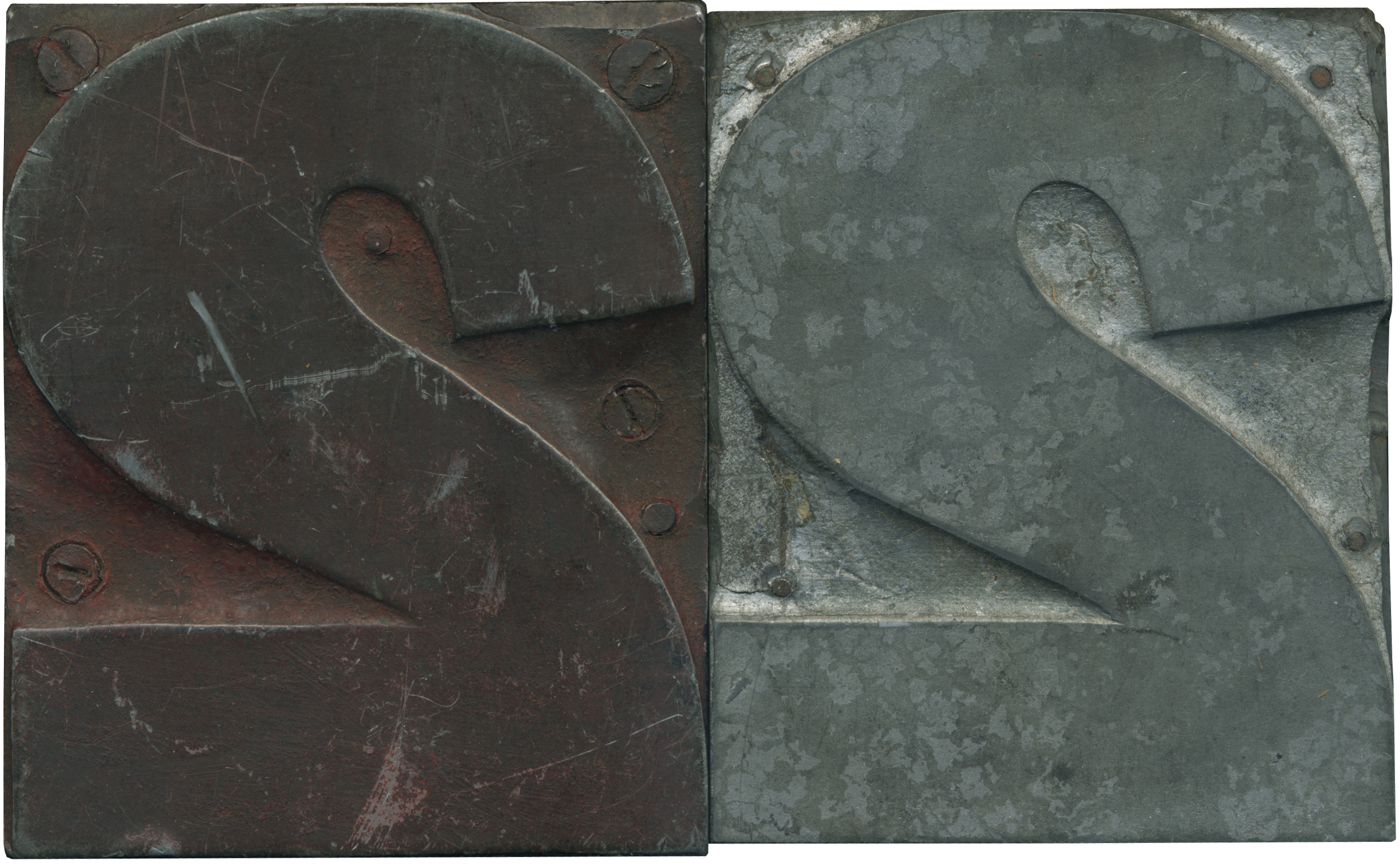
Ok, so way back in February I posted this daily block; a metal faced grotesque two with a wood backing. While out type hunting, I came across a set of numbers that appeared to be made in the same way, with the same typeface, and a very similar size. When I brought this set home, my suspicions were confirmed, it is the same face, and the same size, and they ...
No Comments » Read More →11.18.10
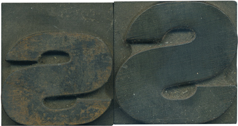
I love comparing the upper and lowercase forms of letters when both are similar to each other. Oftentimes they are more different than they look at first glance. The lowercase S is very squished; look at how flat the top curve of the stroke is! The lowercase letter is still caked with ink, I love the texture old ink has when it starts to flake off an old block. Style: Gothic ...
No Comments » Read More →11.17.10
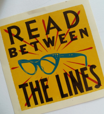
I wanted to ask everyone to please donate to this great project by Kyle Durrie of Power and Light Press. She is going to buy a breadtruck and outfit it with all sorts of letterpress goodies then drive across the country, printing and teaching. Watch the wonderful video she’s made outlining her plan here: http://www.kickstarter.com/projects/powerandlightpress/moveable-type-cross-country-adventures-in-printing This is a great idea and I hope you can help!
No Comments » Read More →


