12.01.10
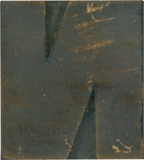
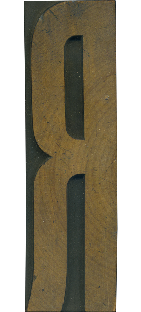
Here is a wonderful, solid N. It’s incredibly thick, and seems to be even thicker than some of the other letters in the alphabet. The negative area is comprised of two small triangles, and the rest of the block is engulfed with the gigantic letterform. The face is stained completely except for a few areas where it’s been scraped off. Style: Grotesque Style first appeared: Unknown Size: 15 line Manufacturer: Hamilton Manufacturing Method: Pantograph Is it ...
No Comments » Read More →11.30.10
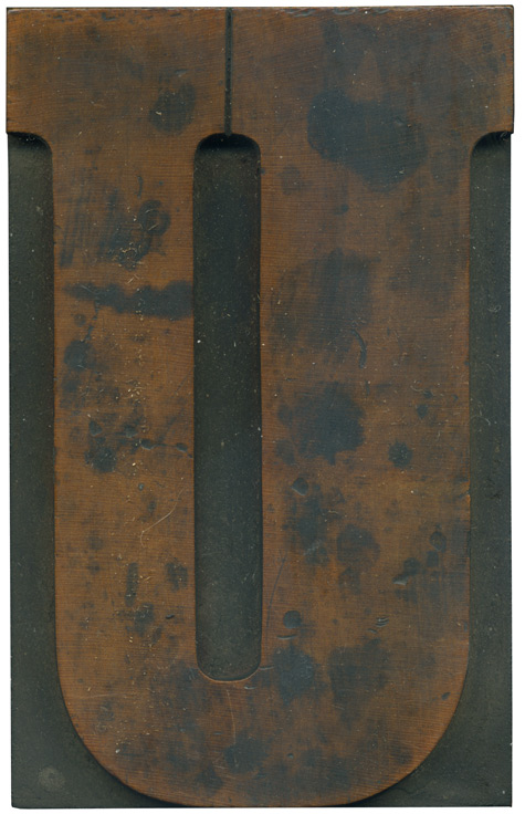
I love the letter U, and this is one of my favorites. The face is so lovely, I love the rich red color, the splotchy staining, and there are a number of little imperfections on the surface that show up in print. The proportion of the stroke weights is very nice. It’s obvious, but not too heavy handed. Style: Clarendon Condensed Bold Style first appeared: Late 1800’s Size: 24 line Manufacturer: Unknown Manufacturing Method: Pantograph Is ...
No Comments » Read More →11.29.10
This thing is monolithic. A 6.5 inch, beautiful R carved out of a lovely piece of end grain wood. The letterform has few frills, but I just love the little kick out on the leg. It’s a very nice curve; not too fancy, but just enough to really set it off. The face on this block is one of the most lovely I’ve seen. The rings from the grain fall ...
No Comments » Read More →11.23.10
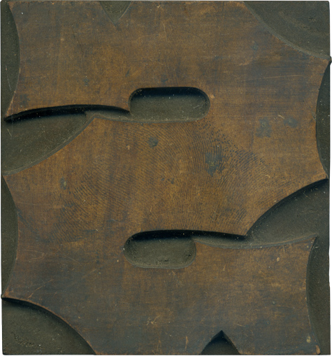
Someone pinch me. I still can’t believe I got a hold of a whole set like this. This S is one of the more lovely pieces from the font at the moment, pre-cleaning. The style is Antique Tuscan, a slab serif with concave indentions on the outside of the letter form, and thorn-like ornamentation on the edges. The face is a stunning golden color, set off even more by how ...
3 Comments » Read More →


