11.17.10
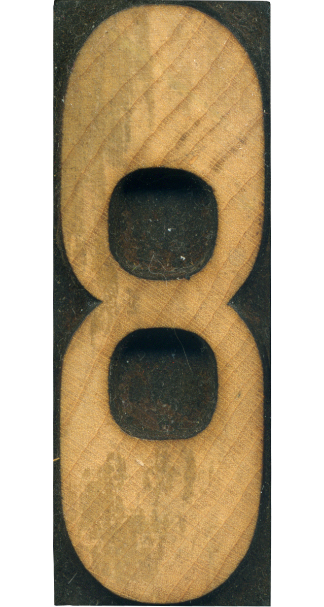
Ah, here is a beautiful little French Clarendon block. I love how light the wood on this block is, because so many blocks are cut from a darker wood. The number is so abstracted by the larger stroke widths at the top and bottom. I love how small and pushed together the counters are. Style: French Clarendon No. 2 Style first appeared: 1873 Size: 12 line Manufacturer: Hamilton Manufacturing Method: Pantograph Is it part of a ...
No Comments » Read More →11.16.10
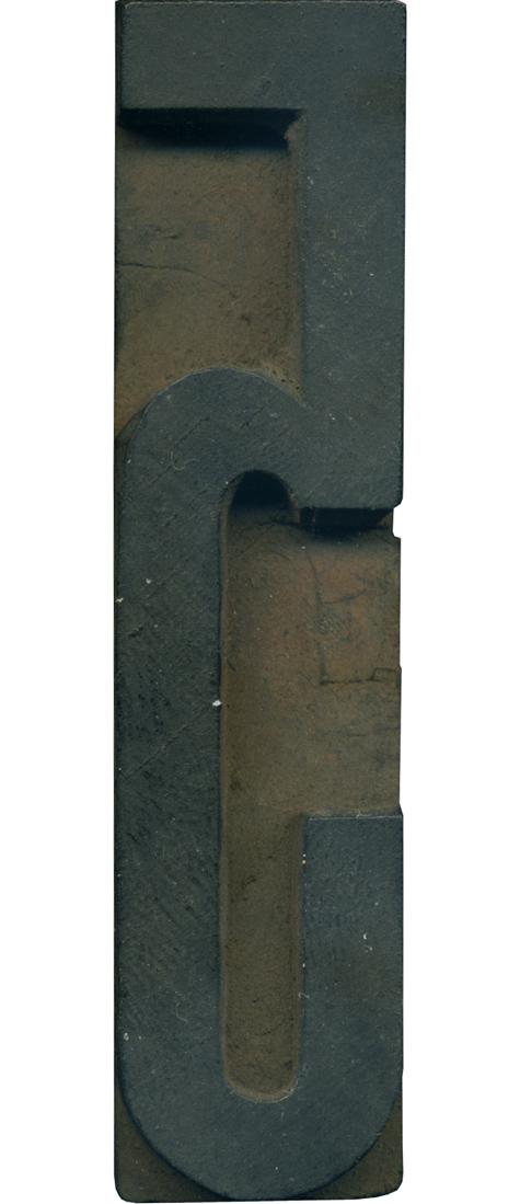
I love the proportions on this block. The loop at the bottom is so tall, leaving the top half of the number to seem a bit squished. It feels very retro. This guy is still very dusty and needs a good scrubbing, hopefully there is a nice wood tone underneath there. Style: Gothic Condensed (still researching) Style first appeared: Unknown Size: 18 line Manufacturer: Unknown Manufacturing Method: Pantograph Is it part of a complete set? ...
No Comments » Read More →11.15.10
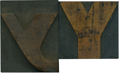
This lowercase Y is just incredible. I love how irregular and playful it is compared to it’s older brother. It’s almost nebulous, like it was formed accidentally. i think with a bit of cleaning the face on the lowercase Y will be the same bright golden tone of the uppercase letter. I love the blotchy stains on the uppercase letterform. Style: Gothic Extended (still researching) Style first appeared: Unknown Size: 12 line Manufacturer: Unknown Manufacturing ...
No Comments » Read More →11.10.10
Iposted about this block awhile back, i think but I wanted to revisit it just because it’s so bizarre. When you think of typeface styles that were commonly used in wood type, this probably doesn’t come to mind. This block came in the same lot as the J I posted earlier, and was probably cut by a printer as well. It’s so exaggerated from a vertical standpoint, it’s almost cartoonish. ...
No Comments » Read More →




![PROFESSOR TOBIN […] SPIRITUALISM’S HUMBUGS / SPIRITUALISTIC JUGGLERY / EXPOSED 💀](https://live.staticflickr.com/65535/54098372074_20bc775da2_s.jpg)
![HERR DOBLER […] ✠ DARK SEANCE ✠](https://live.staticflickr.com/65535/54097172372_f3d1807bd4_s.jpg)
![HERR DOBLER […] DARK SEANCE 👻](https://live.staticflickr.com/65535/54098371949_d42db78b79_s.jpg)


![Red Roses Press [Wood Type]](https://live.staticflickr.com/65535/53488240739_825eec6c1e_s.jpg)


