02.18.10
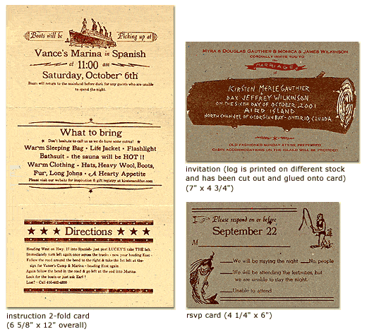
The Isle of Printing is a print shop located in Nashville, Tennessee. Their work features some outstanding linoleum cut illustrations. The artwork gives their work a distinct personality that is really playful. I especially love the invitations on their website, they are each unique and a lot of fun. Check out their website to see more of their fantastic work! I love this illustration and how the typography fits in. This is ...
No Comments » Read More →02.17.10
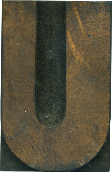
I have a soft spot for U’s with uneven stroke weights, like this one. It lends asymmetry to an otherwise mirrored letterform. I feel like it gives it a weird sense of dimension, like one side it pushing forward. I don’t know which gothic variant this letterform is from, but I’d guess it’s from an early grotesque style with the thick and thin stroke. The face is covered with a film ...
No Comments » Read More →02.16.10
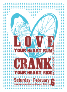
BirdDog Press is a great collaborative design studio and collaborative print shop headed by Allie Bozeman based out of Lyons, Colorado. They have some great examples of business cards and posters, but I really love their cards. I love the ones where she uses eyelets to accentuate the design. The letterpress process has on form of dimensionality, and those add another! Don’t miss browsing through their website, shop and flickr ...
No Comments » Read More →02.16.10
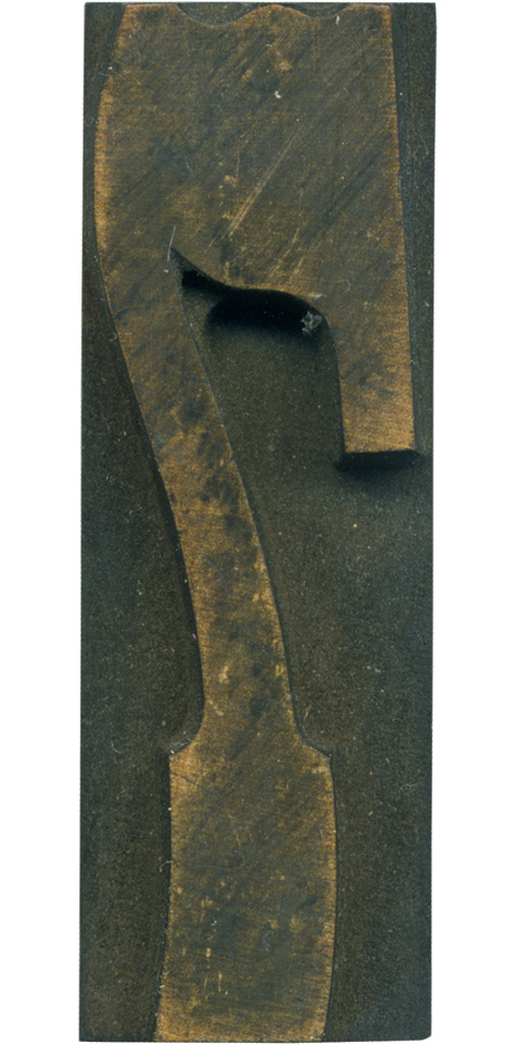
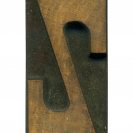
This is the 7 from the French Clarendon set. It’s always seemed a little too condensed for the rest of the typeface to my eyes, but it’s still a lovely and interesting letterform. It’s got the lovely dips in the top, the curve in the slab serif at the bottom, and the beautiful angle where the stem meets the arm and curves out to make the serif. The curve on ...
No Comments » Read More →


