10.11.10
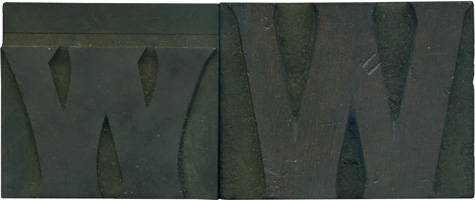
To begin the discussion of these blocks, while I bought these together in one lot, I don’t think these two letterforms are a pair. The lowercase W is obviously a die cut. You can see the horizontal line above the letterform, which is the dead giveaway that a die was stamped onto the wood to make the letterform. But, if you look at the uppercase letter, there seems to be ...
No Comments » Read More →10.08.10
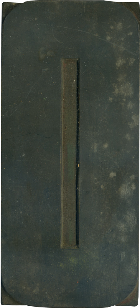
We will finish off the week with a very large block from the poster type set. I really love it when normally round letterforms are made more square. This block is especially grimy and dusty. You can see traces of red ink in the counter. Style: Airport Tourist/ Futura Display variant? Style first appeared: 1932 Size: 48 line Manufacturer: Unknown Manufacturing Method: Pantograph Is it part of a complete set? No
No Comments » Read More →10.07.10
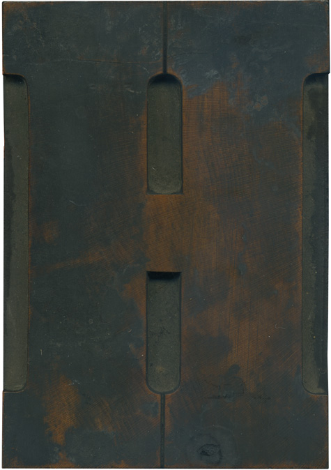
I think I’ve mentioned before that the uppercase H is a hard letter form for me to love, despite being my last initial. Well, this beauty breaks that trend. It’s formal but friendly with those rounded brackets which make such a neat little circle shape at the top and bottom. The face is a stunning, rich reddish color that’s got blotchy, caked area on it, which just add to its ...
No Comments » Read More →10.06.10
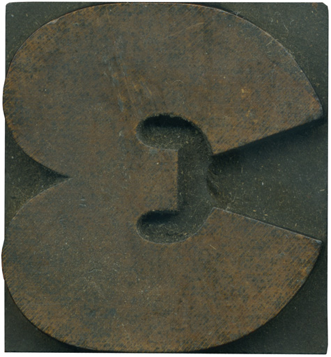
This little fellow really shows how extended this gothic face is. It is probably a derivation of a much more geometric, perfectly round letter, and it’s been puuuuuuled out. I love the shape the negative space on the right side makes, like a robot claw reaching into something. This block has a golden tint to it and is in need of some cleaning. Style: Gothic Extended (still researching) Style first appeared: Unknown Size: ...
2 Comments » Read More →


