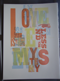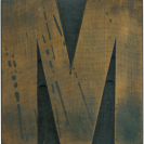


11.03.10
I love this block. Pieces of type like this are usable works of art. The letterform itself is so heavy but it isn’t brutish. The arrow shapes that appear in the counter spaces are fascinating to me. The serifs aren’t as thick as many styles of clarendon, which makes the letter look a bit more modern. You can see the pantograph marks in the counter spaces. The face is one of ...
Read More →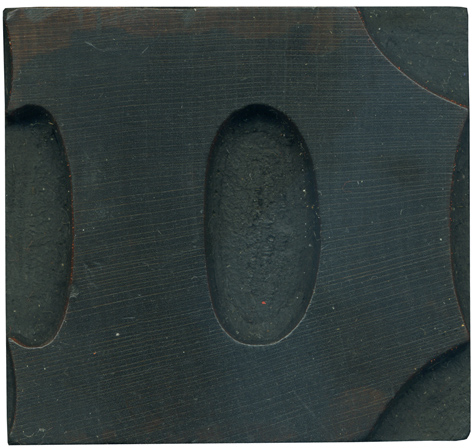
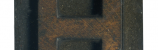
11.02.10
This beauty was one of the blocks I got with my first mixed set of wood type. Antique Tuscans are characterized by the concave curves along the edges of the letterforms, and the pointy little ends on the serifs. I really love the large oval counter in the middle, which is a nice simple contrast to the ornateness of the rest of the letter. There are bits of red ink ...
Read More →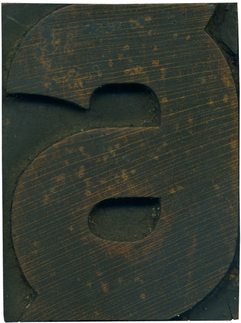
11.01.10
We are going to kick off the week with a lovely little 6. The triangular little ornaments that characterize this font are in full effect here. This figure feels unstable to me, the protrusions feel make the number feel like it should be spinning. After a good scrubbing, you can see the color of the grain, I love the streaks of gold that cross the face. I also love the ...
Read More →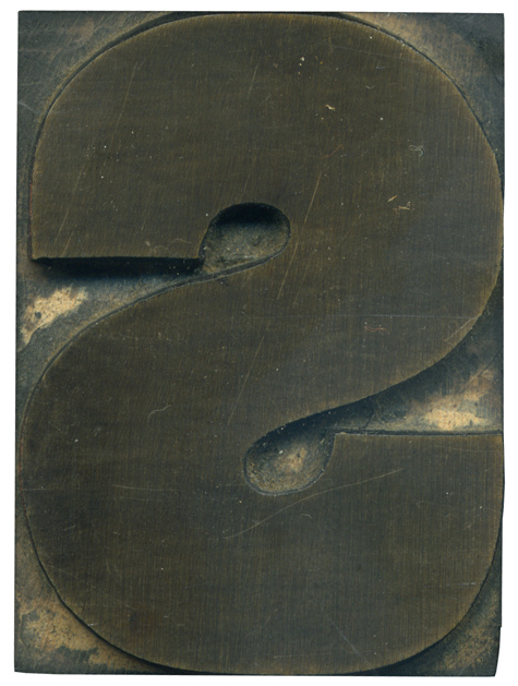
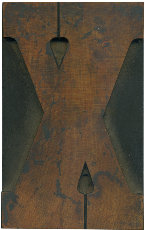
10.29.10
It’s really interesting to compare this block to its gothic cousin. This letter seems more squished into the space allowed on the block, and the ends of the strokes come farther into the middle. The stroke on this letterform is also considerable thicker. These letters offer a great comparison to the differences between a grotesque sans serif and a gothic. There is a bit of irregularity from the hand finishing ...
Read More →