
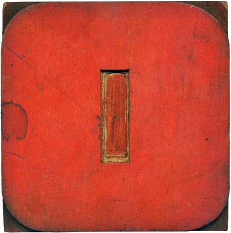
12.29.09
Here is another industrial-esque typeface, with squared off counters, like the blue B. I’m not sure if it is an O or a zero. The fact that it is red makes me lean towards zero. This block is a favorite of mine; a nice, symmetrical number with great color.
Read More →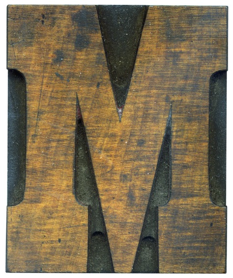
12.14.09
This is one of the first blocks I got when I started collecting wood type. It’s got a great color and texture, combined with a lovely typeface. I also love how you can clearly see the pantograph marks on this block. The more obvious marks at the bottom of the letterform was made with a larger pantograph bit, and the tighter details were taken care of with a smaller bit, ...
Read More →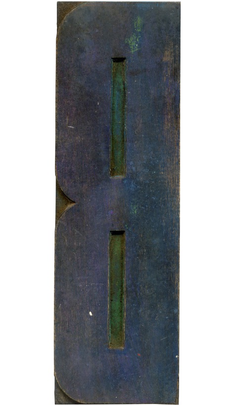
11.26.09
Another large poster block that has some very bright colors showing through. I really enjoy these super condensed typefaces, and I love how the counters are squared off.
Read More →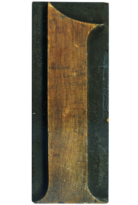
11.24.09
Now, I have to admit, I am partial to big, chunky wood type letterforms. But there is something charming about the more classical serifs in type, especially the numbers.
Read More →