
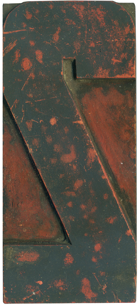
02.12.10
The number 2 seems to be the most frequent figure I post for End Grain. This particular 2 came from the modern poster lot, though it’s smaller than the majority and only has one or two matching figures that go along with it. It’s a variant on the really bulky industrial style 2 that I posted way back at the end of December. The outer corners are rounded while ...
Read More →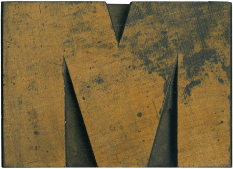
02.11.10
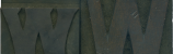
Is there anything better than a nice meaty wood type block? Of course not! This block is from a very early sans serif typeface which I adore, but have been unable to obtain a complete set of. The Rob Roy Kelly Collection has a very similar face. The letterforms are all quite mismatched and awkward and for whatever reason I love it. This M is quite extended, which doesn’t seem ...
Read More →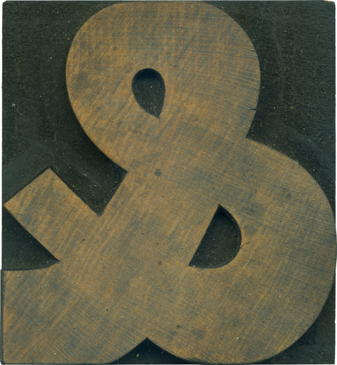
02.10.10
This ampersand is from the gothic set I have. Characteristic of the typeface, it has some variation in the stroke weight, though it’s not nearly as awkward as some of the very early sans serifs. I really love how the stroke widens at the bottom loop of the ampersand. It looks like a living creature coiled up upon itself. The thicker weight also lend it a stability and firmness some ...
Read More →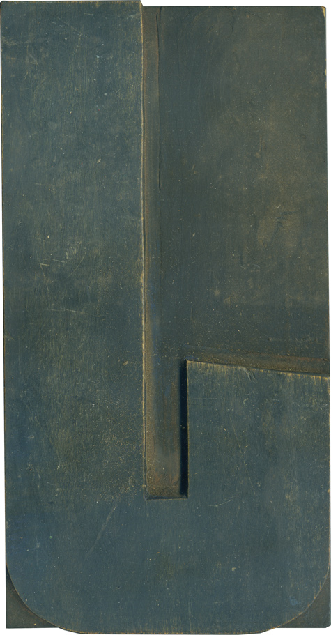
02.09.10
Of all the Js in the modern poster lot, this is my favorite, if only for that little angle at the end of the stroke. A few of the other blocks had details like this at one time which were leveled off for some reason or another. This has one of the thicker weights from the set, which I think contrasts nicely with the flashy little slant. Looking at typefaces ...
Read More →