


03.08.10
I am partial to the letter B for obvious reasons, so to have one in this nice typeface at such a large size is a real treat. Unlike some of the letterforms from the large poster lot, this B has some really nice variations between the curves, specifically the joint between the two bowls and the top and bottom of the letterform. It’s more squared off in the center, and ...
Read More →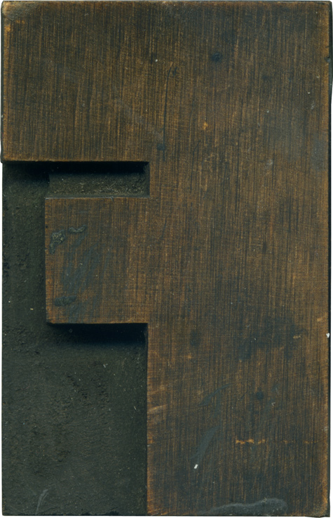
03.05.10
Here is a wonderful F on this Fabuluous Friday. I only have two or three blocks in this style, and I wish I had more. It’s definitely the thickest typeface I have, I’m not sure something this hefty would work on anything other than a sans serif. The difference and size and length between the top and middle arms is fantastic, and the counter space between them is so ...
Read More →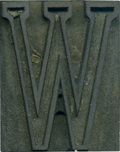
03.04.10
The first mixed lot I bought has a handful of letters in this outlined typeface. It’s the only outlined typeface I have, and I wish I had a complete set. It’s rather tiny, just over 1 in. tall. Blowing up tiny faces to this size reveals a lot of tiny inconsistencies, like the stroke weight, which varies wildly in various places. I love the serifs all lined up ...
Read More →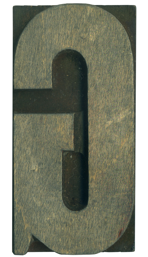
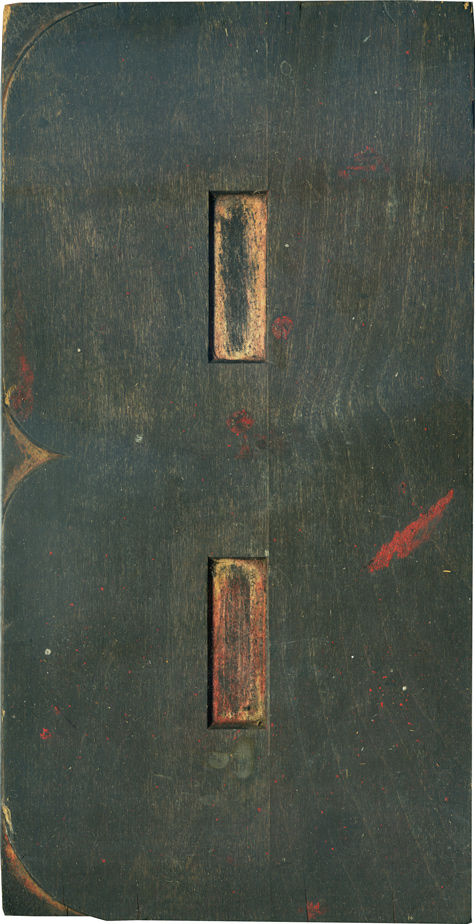
03.03.10
This is a random orphan from a mixed lot, but it has a lot of neat little characteristics. It’s pretty much straight sided, but it’s got really long curves at the top and bottom. The tail is very pronounced, which I love. The serif has a bit of an angle from the hand finishing, and it seems like the top of the stroke flares out just slightly. There is a ...
Read More →