


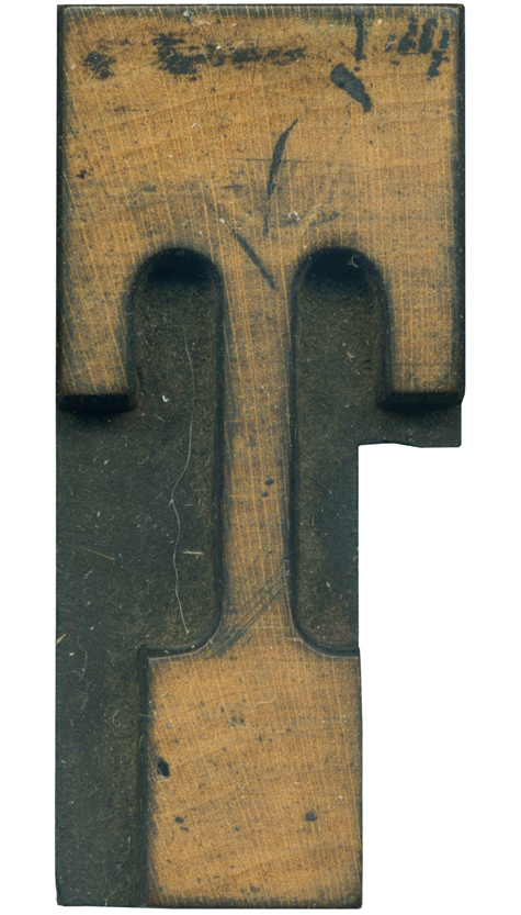
05.20.10
I love T’s that have downward serifs coming off of the top. They look so statuesque! This is from the French Clarendon set, so it has generous brackets and very tall, thick serifs. The brackets are so extreme that the underside of the top line doesn’t have any room for straight lines, one bracket melds into another. This block has been cut into for kerning purposes, and man, did they ...
Read More →
05.19.10
I am not sure what the proper term is for a one with that little notch cut out, but I think it’s fabulous. This is the only 1 I have in that style, and it’s rather petite. It belongs to the lovely fat gothic face I love so much and have been trying to find a complete set of. This style is more compact than a 1 with a “flag” ...
Read More →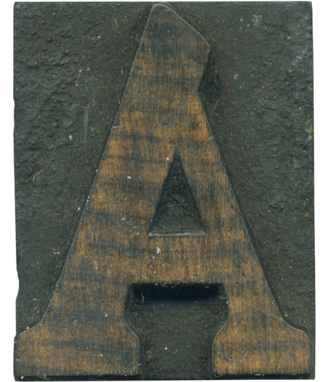
05.14.10
This A was part of one of the first projects I did involving wood type. We had to pick a museum and create a new logo for it and 3 magazine ads, and I used this A in one of the ads. Cheltenham is an interesting typeface, it feels to me like a mixture of clarendon faces and old style. It’s a heavy weight typeface with brackets and thick serifs. ...
Read More →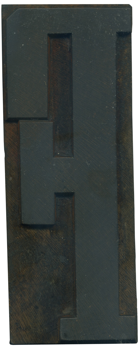
05.13.10
This F has one of the most unique characteristics of this particular Grecian face; the gigantic serif on the middle arm. It’s much thicker than most wood type Grecians, and it really changes the whole feel of the letterform. The whole thing looks like it’s about to tip over! Another interesting thing is the hairline space between that top serif and the cross arm serif. One issue common in a lot ...
Read More →

![PROFESSOR TOBIN […] SPIRITUALISM’S HUMBUGS / SPIRITUALISTIC JUGGLERY / EXPOSED 💀](https://live.staticflickr.com/65535/54098372074_20bc775da2_s.jpg)
![HERR DOBLER […] ✠ DARK SEANCE ✠](https://live.staticflickr.com/65535/54097172372_f3d1807bd4_s.jpg)
![HERR DOBLER […] DARK SEANCE 👻](https://live.staticflickr.com/65535/54098371949_d42db78b79_s.jpg)


![Red Roses Press [Wood Type]](https://live.staticflickr.com/65535/53488240739_825eec6c1e_s.jpg)


