


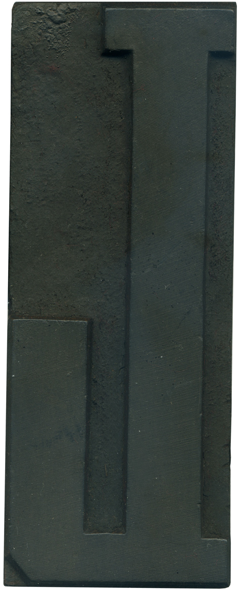
06.02.10
This is one of my favorite L’s, it’s nice and compact and very sturdy. The serif on the end of the leg is just so huge, it almost looks too big. I think a lot of wood type L’s can look awkward because the legs are too long, but this one feels just right. If you look real close at the top serifs you can see they are different thicknesses. ...
Read More →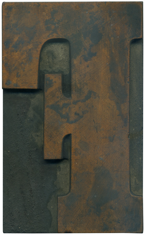
06.01.10
What a beautiful block this is! After printing this alphabet several weeks ago I was stunned to find many of them cleaned up wonderfully, revealing this splendidly rich face. one of the things that makes this typeface so fun is how short the serifs are, making it a bit more current than the french clarendons. The face of this block sits very high off the shoulder, so the router marks ...
Read More →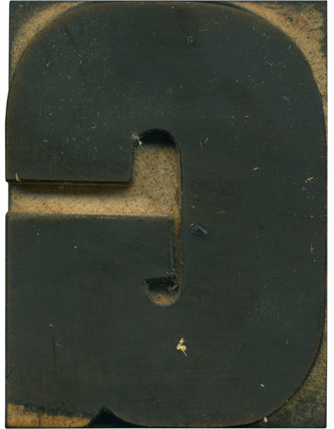
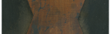
05.28.10
This block is unique in that there are pars of the shoulder that remain unscathed, while the face is stained pretty dark. The very bottom left portion of the block isn’t stained, which is something I noticed on several blocks from this set. This block must have been cleaned quickly and lightly, because the ink didn’t get pushed on the shoulder by the rag or washed into it by excessive ...
Read More →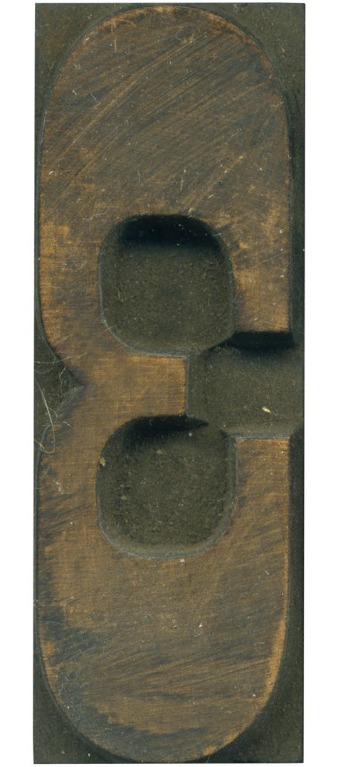
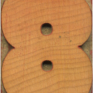
05.27.10
I love this numeral. It’s quite abstract, I find it nearly unrecognizable when it is turned on its side. The router tracks are barely visible in the counter, there’s just a bit of raised area left that the bit couldn’t knock out. There is a lot of half wiped off ink left on the face, which makes for a great texture. Style: French Clarendon No. 2 Style first appeared: 1873 Size: 12 line Manufacturer: ...
Read More →