

06.16.10
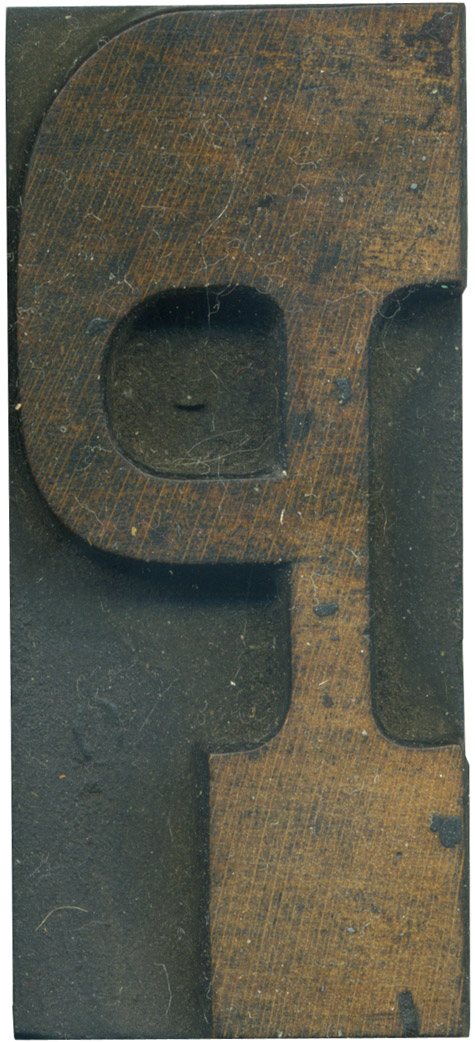
This letterform seems very unbalanced to my eyes. The bowl coming out of the thick serif at the top makes it so top heavy, and it seems like it could top over to the left at the slightest provocation. I love the color of the wood, and how the top of the letter is more stained than the bottom. Style: French Clarendon No. 2 Style first appeared: 1873 Size: 12 line Manufacturer: Hamilton Manufacturing Method: ...
Read More →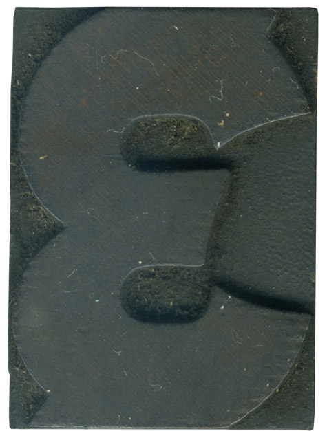
06.15.10
The numerals in this set are fantastic! They have so many little nuances and a lot of ornamentation. This guy is in very good shape, you can even see the wood face on the top half of the numeral. I just love how the ends of the face are rounded, so those curves meet at the mid right with the curves in the counters as well. It’s very organic and ...
Read More →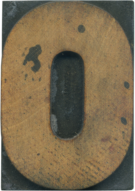
06.11.10
Here is a wonderful little symmetrical letterform to close out the week. You can see remnants of red ink on the face, and the big dark stains that are scattered about as well. The sides never feel like they quite go completely straight, it retains a really nice roundness. Style: Gothic Style first appeared: Unknown Size: 15 line Manufacturer: Hamilton Manufacturing Method: Pantograph Is it part of a complete set? Yes
Read More →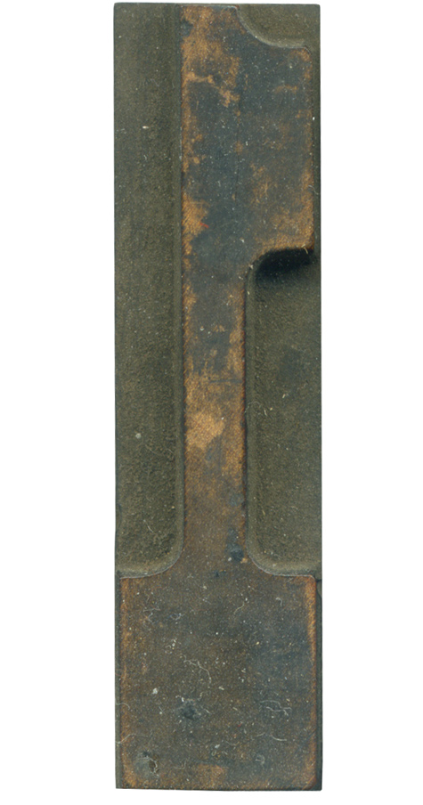
06.10.10
One of my favorite numerals. It’s so bottom heavy with that massive serif, and the “flag” ornamentation at the top is such an interesting shape. The face has weathered beautifully, with a great mixture of tones. It’s always fun to find variations of forms that can tend to be a bit repetitive and stale. Style: French Clarendon No. 2 Style first appeared: 1873 Size: 12 line Manufacturer: Hamilton Manufacturing Method: Pantograph Is it part of a ...
Read More →