11.15.09
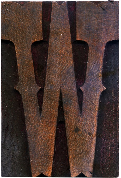
This is a lovely block, it cleaned fairly well and it’s got lots of little nicks and scratches that show what it’s been through. One great thing about this typeface is that it’s a combination of two styles that emerged during the heydey of wood type. It has the slab serifs of an egyptian typeface, but has these really interesting quirks, like the indentations on the top and bottom of ...
No Comments » Read More →11.15.09
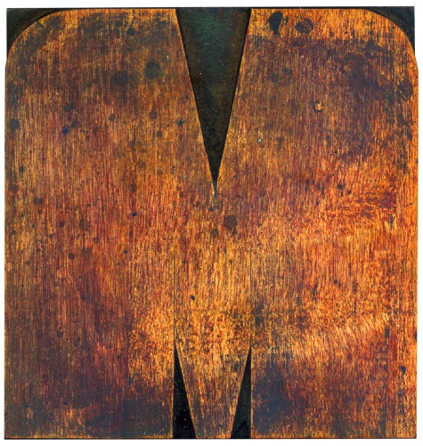
This M is one of my favorite blocks. It's fat and exaggerated and it seems almost out of place ona wood block.
No Comments » Read More →08.13.09
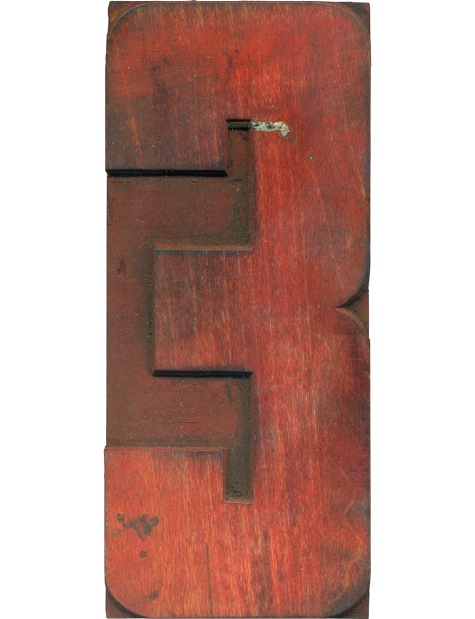
There's something inherently wonderful about letters that have been stained with a certain color.
No Comments » Read More →08.13.09
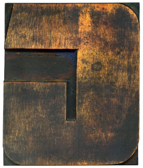
I find the mixture of wood and these more “modern” types of letterforms to be really interesting. I would guess these style typefaces came around near the end of wood type’s life.
No Comments » Read More →





![PROFESSOR TOBIN […] SPIRITUALISM’S HUMBUGS / SPIRITUALISTIC JUGGLERY / EXPOSED 💀](https://live.staticflickr.com/65535/54098372074_20bc775da2_s.jpg)
![HERR DOBLER […] ✠ DARK SEANCE ✠](https://live.staticflickr.com/65535/54097172372_f3d1807bd4_s.jpg)
![HERR DOBLER […] DARK SEANCE 👻](https://live.staticflickr.com/65535/54098371949_d42db78b79_s.jpg)


![Red Roses Press [Wood Type]](https://live.staticflickr.com/65535/53488240739_825eec6c1e_s.jpg)


