01.14.10
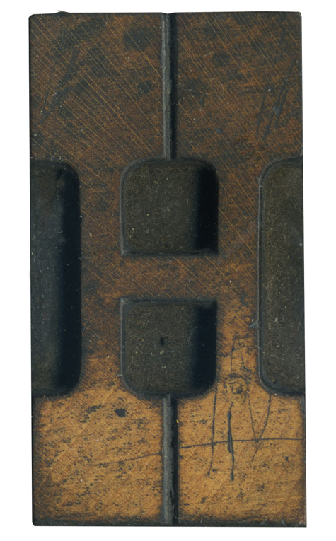
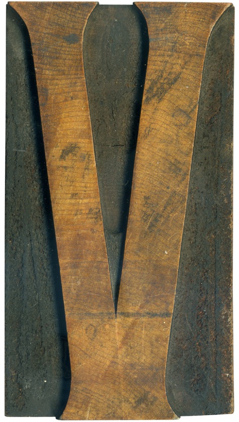
I think the face of this block is fascinating. On the top half, the grain is stained and darker, with the diagonal streaks from the grain taking dominance. But on the bottom half, the real color of the wood shows through and you can see the rings of the wood, which run perpendicular to the lines on the top half. The two colors of the different halves go well together, ...
No Comments » Read More →01.13.10
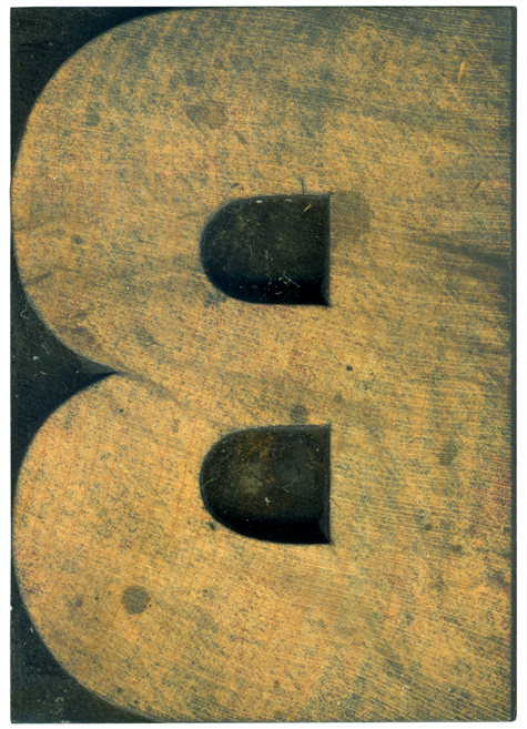
This B is from the gothic set I got a few summers back. I haven’t cleaned it off properly because I like how the dried ink is streaked across the face. There is actually red ink in the tiny holes in the face of the wood. There are also some dark drip marks from some sloppy cleanup. The wood used on this font is very light and pale, I’m doing ...
No Comments » Read More →01.12.10
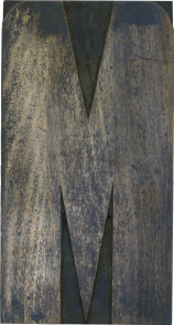
Here is another letter from the modern poster type lot. The biggest oddity with this block is the trenches left by whatever tool was used to carve it. This seemed to me to be too gruesome to be the work of a pantograph, but after a conversation with Nick Sherman he has convinced me that it could have been created by pantograph, just a little sloppily (Here is a great ...
No Comments » Read More →01.11.10
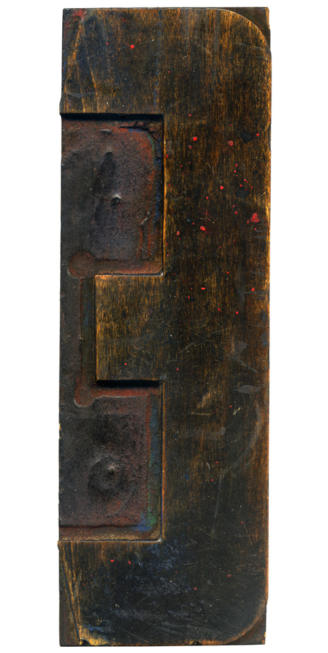
This block is from a typeface style I am sorely lacking in my collection. I associate this style more with lithography or artistic printing, which would use these ornate typefaces. But when I think of artistic printing I think of smaller items, and not large poster sized type like this block. The typeface appears to be Teniers, first shown by William Morgans and H.K. Wilcox in 1884. The rings in this ...
No Comments » Read More →


