05.03.10
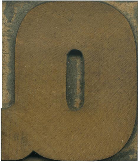
I can’t help but grin at Q’s that are little more than O’s with tails stuck on. Where is the imagination?! There are of course limitations when designing a letterform for a typeface like this. Descenders make type much more difficult to set, and this face is so heavy that if the tail cut through to the counter, there wouldn’t be much negative space left! This is a great straight ...
No Comments » Read More →04.30.10
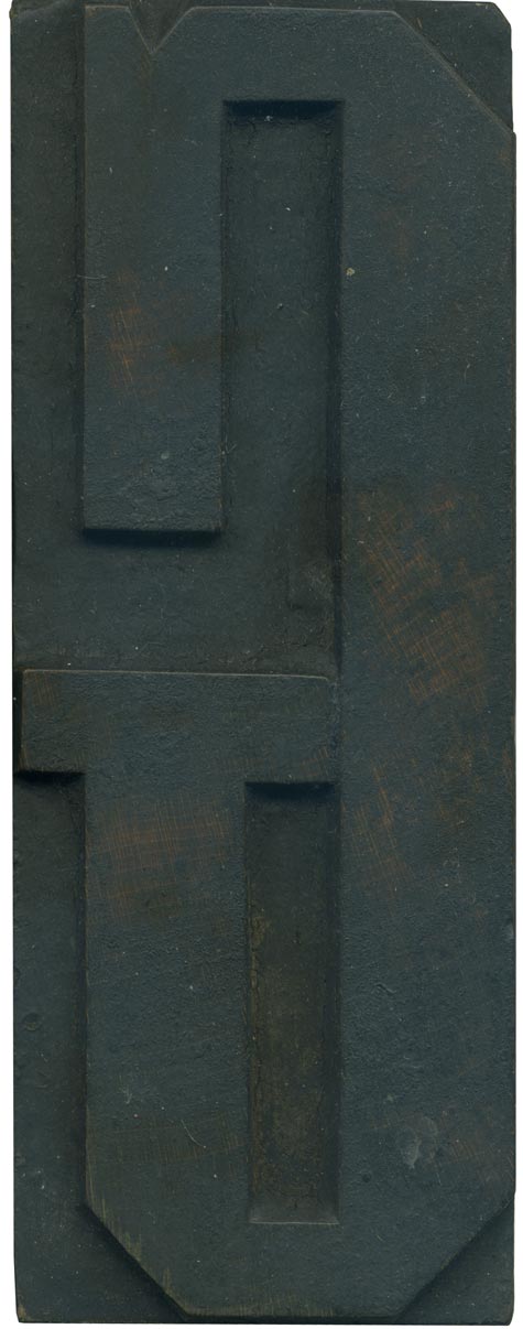
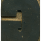
The G from this Grecian set is a very nice letterform. I love how the bar crosses completely across the counter space, leaving only a tiny hairline of negative area. I also adore the little notch at the top of the stroke, it gives the letter a decided attitude, it looks like a furrowed brow to me! Combine that with the line beneath it and he definitely seems to be ...
No Comments » Read More →04.29.10
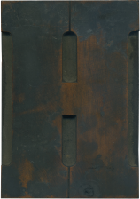
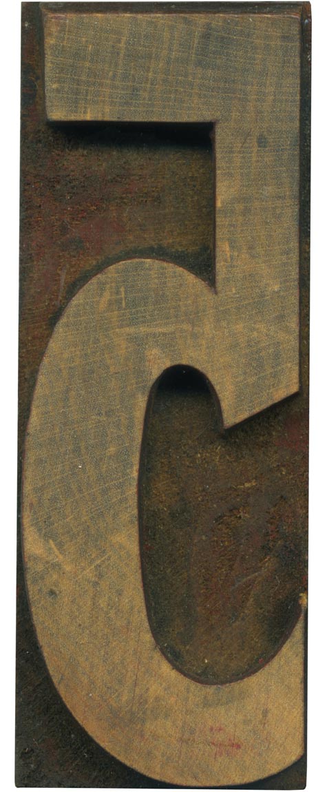
This is an orphaned block that I got with one of my first mixed lots. It might be a condensed version of futura. This style is quite odd, it’s got a different feel from the early grotesque faces, but it doesn’t fit with the uniform weight, geometric modern gothics either. The loop of the 5 is very tall, and the stroke weight varies quite a bit, where the top is ...
2 Comments » Read More →04.28.10
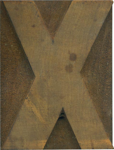
Seeing Mr. Wolske’s wonderful Tuscan X inspired me to use an X as the next daily block, albeit a much more drab one! This is from a grotesque face, so there is some variation in stroke weight, which I always enjoy in a symmetrical letterform like this one. The irregular weights shift everything around, it feels like the whole thing is turning. This block hasn’t been used much, the shoulder is ...
No Comments » Read More →