05.25.10
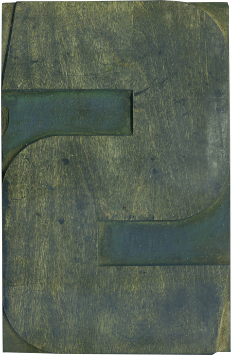
This chunky fellow is from the modern poster lot, and like many of his S counterparts, he has lots of blue ink still hanging around in the shoulder. The whole block has taken on a rather sickly appearance from the blue and green inks that were used. The face has a few scratches but it’s in great shape overall. Even though these blocks are side grain, they are remarkably smooth ...
No Comments » Read More →05.24.10
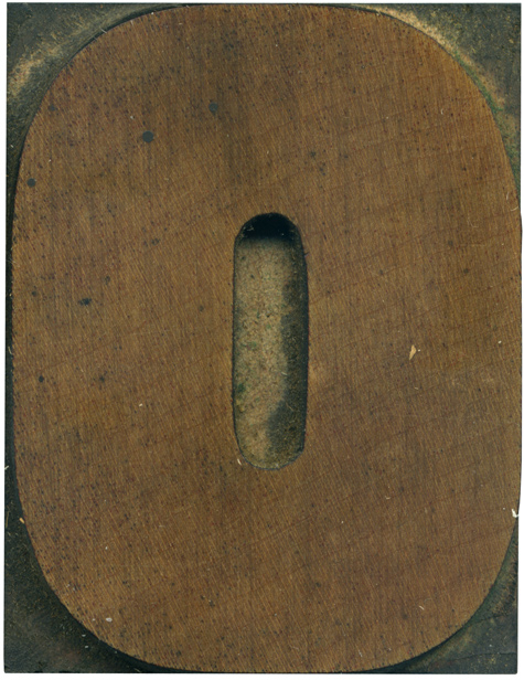
You would think that the O would be one of the simplest, most uniform blocks in the alphabet, right? Well, this one has quite a few un-uniform characteristics about it. Notice the differences in the arches at the sides of the letterform. The counter is also quite irregular. The left side has a straight edge, but the right has a bit of an curve to it. I love the ...
No Comments » Read More →05.21.10
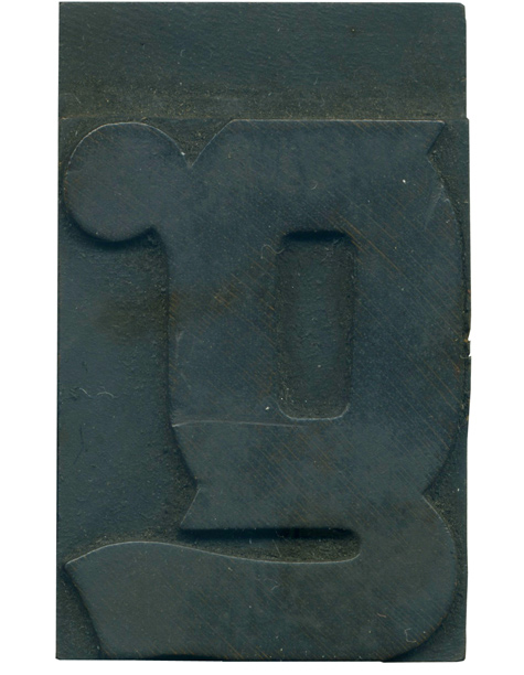
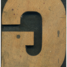
The lowercase “g” is one of the most fantastic and varied letterforms in the alphabet, in my humble opinion. This is one of the standouts. The bowl has those great little jagged ornamentations that are a feature in the typeface, and the tail grows out from the bottom portion. It’s surprisingly flowing and organic to be in such a compact space, and it stands out in a typeface that features ...
No Comments » Read More →05.20.10
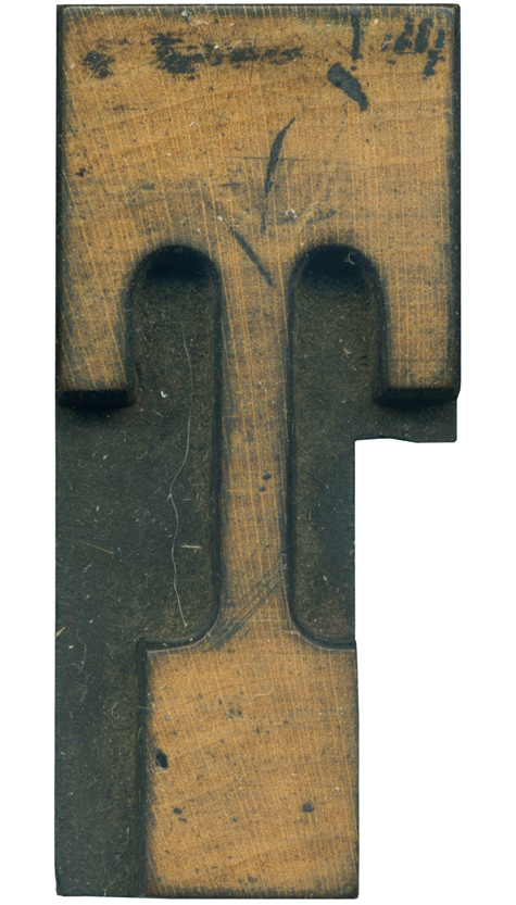
I love T’s that have downward serifs coming off of the top. They look so statuesque! This is from the French Clarendon set, so it has generous brackets and very tall, thick serifs. The brackets are so extreme that the underside of the top line doesn’t have any room for straight lines, one bracket melds into another. This block has been cut into for kerning purposes, and man, did they ...
No Comments » Read More →


