06.07.10
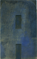
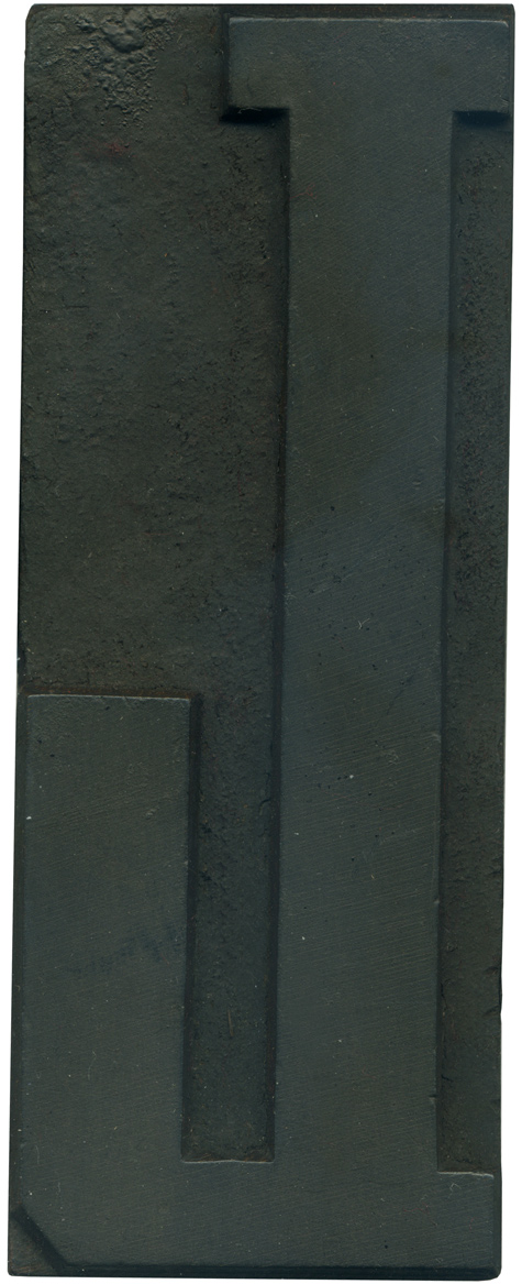
I love the letter U, and I love it even more when it’s gigantic. This is a simple letterform, but I love the angles on the bottom corners. Not quite perfectly symmetrical. You can see a line of ink remaining in the counter. Style: Airport Tourist/ Futura Display variant? Style first appeared: 1932 Size: 48 line Manufacturer: Unknown Manufacturing Method: Pantograph Is it part of a complete set? No
No Comments » Read More →06.04.10
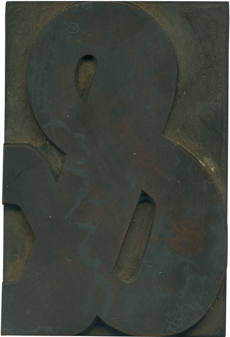
Not every set of type you come across still has the ampersand, so I was thrilled when I saw this fellow in the type case. It’s nice and restrained; compact and sensible. It has plenty of variation in the stroke width but it is so nicely contained. Many of the wood type ampersands I have are very wide and irregular, and often don’t fit well with the rest of the ...
No Comments » Read More →06.03.10
06.02.10
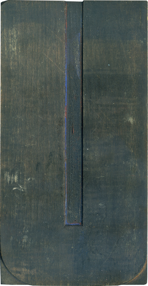
This is one of my favorite L’s, it’s nice and compact and very sturdy. The serif on the end of the leg is just so huge, it almost looks too big. I think a lot of wood type L’s can look awkward because the legs are too long, but this one feels just right. If you look real close at the top serifs you can see they are different thicknesses. ...
No Comments » Read More →

