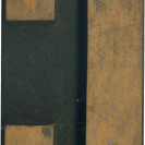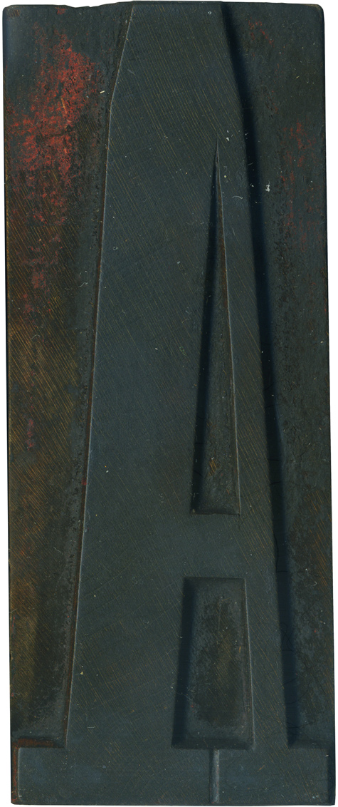
02.02.10
It is about time I start posting letters from this set! As discussed previously, this set is a Grecian style, which is basically a condensed antique with straight corners instead of curves. This face is unique because it was apparently visually copied from a foundry typeface, I have not seen a wood type Grecian to match some of its characteristics. The A exhibits the extreme weight contrast that makes the ...
Read More →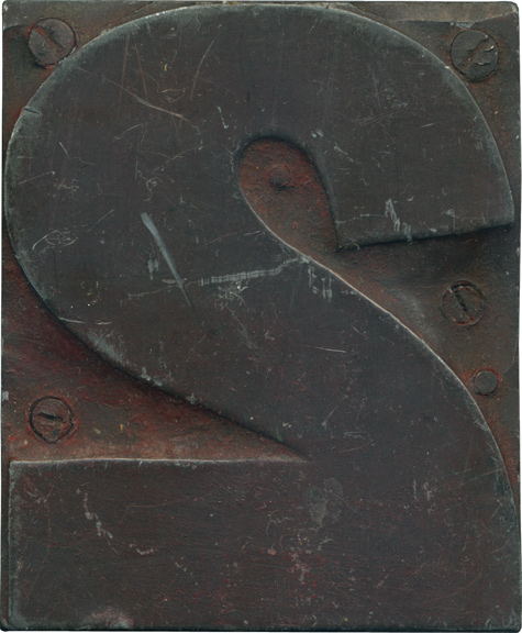
02.01.10
This is obviously not an end grain block! I got this block with a large mixed set several summers ago, and it is the only one I have like it, or have seen like it. It has a metal face and it screwed into a wood back. I expected it to be heavier because of the metal face, but it really surprised me when I first picked it up. You ...
Read More →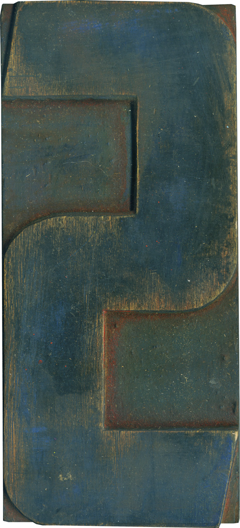
01.29.10
Of the many S blocks from the modern style poster letters I have, this one is probably my favorite, if only for the colors left on the face. There are still traces blue and green on the face, and read on the shoulder. This is one of the bolder versions of the style I have. I love how the ends of the stroke are angled, and how the outer lines ...
Read More →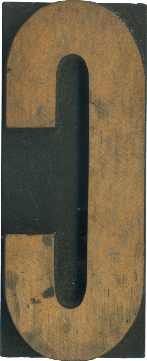
01.28.10
Recently, I’ve become very interested in extremely condensed gothic typefaces. This C is pretty bold, with just a hint of contrast at the top and bottom of the stroke. The face cleaned up well, though there are plenty of hints of wear and tear. There are a few spots and scratches. I don’t have enough blocks of this typeface to identify it, unfortunately. Style: Unknown Gothic Condensed Style first appeared: 1884 Size: 16 ...
Read More →