12.14.10
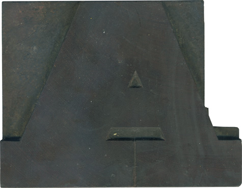
Back to back A’s this week, just because I love them so much! This guy is solid, meaty and wonderfully angular. I love the uneven stroke weight from one side of the letter to another. This guy has been cut into, as many A’s are, for kerning. The serifs on the bottom are so wide that the space between them is just a hairline, an interestingly delicate detail in what ...
Read More →12.13.10
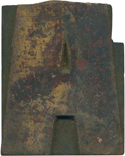
Isn’t this a sad sight? This came in a mixed lot with a bunch of large type, and this letterform would be quite large at full size… easily over 6 inches tall. On top of the top being lopped off, the letter had been cut into for kerning on the right side. The face is absolutely lovely, with flashes of the golden wood visible alongside specks of blue and red ...
Read More →12.10.10
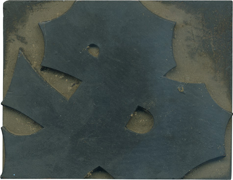
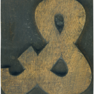
Yay! A lovely typeface and a lovely ampersand! With all of the concave indentations on the outer edges of the stroke this ends up being quite the complicated figure. I love how angular and pointed this guy is, yet the two counters are so simple. This ampersand has a nice solid base, it feels very sturdy and has a great presence. Style: Antique Tuscan Style first appeared: 1849 Size: 20 line Manufacturer: American Wood ...
Read More →12.09.10
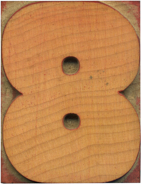
I love a red stained number! What job could be more joyous than proudly declaring low prices, or crucial dates in rich red ink? The counters on this block feel microscopic as they sit in the massive bowls of the number. Style: Grotesque Style first appeared: Unknown Size: 15 line Manufacturer: Hamilton Manufacturing Method: Pantograph Is it part of a complete set? Yes
Read More →



![PROFESSOR TOBIN […] SPIRITUALISM’S HUMBUGS / SPIRITUALISTIC JUGGLERY / EXPOSED 💀](https://live.staticflickr.com/65535/54098372074_20bc775da2_s.jpg)
![HERR DOBLER […] ✠ DARK SEANCE ✠](https://live.staticflickr.com/65535/54097172372_f3d1807bd4_s.jpg)
![HERR DOBLER […] DARK SEANCE 👻](https://live.staticflickr.com/65535/54098371949_d42db78b79_s.jpg)


![Red Roses Press [Wood Type]](https://live.staticflickr.com/65535/53488240739_825eec6c1e_s.jpg)


