


12.29.09
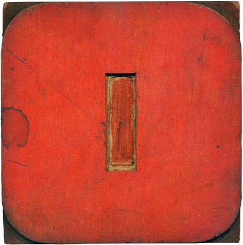
Here is another industrial-esque typeface, with squared off counters, like the blue B. I’m not sure if it is an O or a zero. The fact that it is red makes me lean towards zero. This block is a favorite of mine; a nice, symmetrical number with great color.
Read More →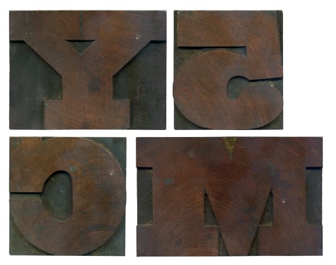
12.26.09
Here are some printed characters from the typeface. These blocks have a wonderful grain, and the holes in the grain seem more pronounced than other blocks I own. I enjoy blowing up images of the blocks and the prints and seeing what imperfections show up in the print. I would like to start doing some in depth research into the history and characteristics of some of the blocks that I have. I’ll start ...
Read More →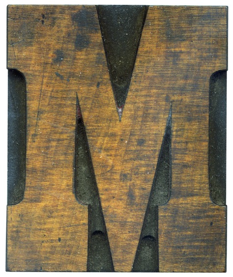
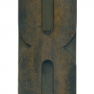
12.14.09
This is one of the first blocks I got when I started collecting wood type. It’s got a great color and texture, combined with a lovely typeface. I also love how you can clearly see the pantograph marks on this block. The more obvious marks at the bottom of the letterform was made with a larger pantograph bit, and the tighter details were taken care of with a smaller bit, ...
Read More →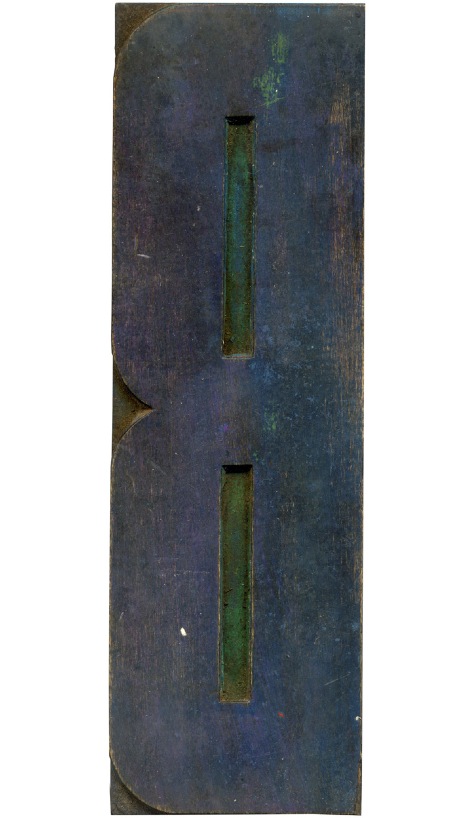
11.26.09
Another large poster block that has some very bright colors showing through. I really enjoy these super condensed typefaces, and I love how the counters are squared off.
Read More →

![PROFESSOR TOBIN […] SPIRITUALISM’S HUMBUGS / SPIRITUALISTIC JUGGLERY / EXPOSED 💀](https://live.staticflickr.com/65535/54098372074_20bc775da2_s.jpg)
![HERR DOBLER […] ✠ DARK SEANCE ✠](https://live.staticflickr.com/65535/54097172372_f3d1807bd4_s.jpg)
![HERR DOBLER […] DARK SEANCE 👻](https://live.staticflickr.com/65535/54098371949_d42db78b79_s.jpg)


![Red Roses Press [Wood Type]](https://live.staticflickr.com/65535/53488240739_825eec6c1e_s.jpg)


